
The Blue Marble Next Generation global image mosaic has been the basis of countless large scale earth visualizations in the past eight years. If you see an artificial image of the planet somewhere – on the internet, in print or in a movie – it is very likely it is based upon this data. I used it myself in quite a lot of my images and I wrote about this data set and its properties in more detail in my review.
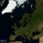
One of the interesting properties of the BMNG mosaic is that it comes in twelve different versions – one for each month of the year. This allows creating renderings depicting a certain time of the year. This feature however also results in certain problems. In many, especially more abstract visualizations, you do not want to depict a certain moment but depict a representative appearance of the earth surface, kind of a typical, characteristic state of the earth surface at every point. To give an example: For renderings of the northern hemisphere (and also global images were the focus of the designer was on the northern hemisphere of course) it is common to use the July mosaic. In July however seasonal snow in high mountain areas and polar regions is still widespread:

You can of course use the August image but this is a tradeoff between reduced old snow and new snow in some areas:

Apart from this regions like southern Europe have the main growth season quite early in the year and both the July and August images show mostly brownish colors in those parts although in early spring these are much greener. When I analyze MODIS satellite data from over the course of the years I can determine the average time of maximum vegetation and get a map like the following:

Note the default date used in areas with insufficient vegetation to reliably determine the maximum is in late summer (August) here. As you can see there are significant local variations at close distance – overall a quite complex pattern. Some of these differences are caused by the relief, some are due to differences in human land use. It would now be possible to combine the twelve BMNG images to a vegetation maximum representation using this map but since these images suffer from other shortcomings and twelve images are somewhat coarse grained and since analyzing the vegetation already requires processing a lot of satellite data anyway I chose to create a new visual color mosaic. After all the Blue Marble Next Generation data basis is nine years old now so it is not a terribly bad idea to update it. The following images shows this new vegetation maximum assembly with a tone mapping approximating the BMNG:

As you can see when comparing to the BMNG images before this results in a much greener appearance in the south with less snow in the mountains. And while this appearance does not occur in reality at any single time as a whole this can be considered a much more characteristic depiction of the earth surface than any single date representation on its own.
Here a magnified view of Greece for comparison (BMNG first and my vegetation maximum mosaic second):


Of course I can equally create a late summer image based on the new data (not exactly the same timeframe as the August BMNG image but you get the idea):
")
This new mosaic is very useful for 3d views, also because it is assembled with full 16 bit processing allowing more accurate colors than the BMNG which is only available in a tone mapped and clipped 8 bit representation.


Compare these to the BMNG based view with a similar perspective.
Like the Blue Marble Next Generation my assembly is based on the MODIS surface reflectance data provided by the USGS. In that way it differs from the Mapbox mosaic I discussed last year which is produced directly from the raw imagery.