I have a significant backlog now of changes i made on the alternative-colors style that i have not discussed here yet. This blog post is about the largest and most significant of these changes, related to the way point symbols and labels are rendered.
Point symbol and label rendering in OSM-Carto has been in a non-satisfying state for a long time. This is largely because almost no fundamental work has been done on this part of the style for many years while the complexity in the form of the variety of different label and symbol types has grown continuously over time. Or in other words: There has been continuous pressure to add new features in the form of labels and symbols to the style combined with the almost complete absence of interest to actually rework the system of label and symbol rendering in a way that actually scales and is able to handle this complexity.
The core of the problem discussed by this blog post is the depiction of blocking elements in an automatically rendered map style. Blocking elements means graphical elements that – as a matter of principle – are not supposed to be overlapping with each other. This is the case for all labels in any map as well as typically also most pictorial symbols used.
Different methods exist to implement the requirement for elements to not overlap. The most significant one is optimizing the placement of symbols and labels accordingly. This whole field consisting of many different techniques i will not cover in this post.
Most digital rule based map rendering systems, however, are fairly primitive when it comes to handling of blocking elements. In those cases the only way of enforcing the non-overlap is by not rendering elements that would overlap other elements which have already been rendered. There is typically no support for cutting out/masking or otherwise modifying symbols to avoid overlaps with others (something i demonstrated with tree symbols in a previous post) and options to tie the rendering of graphical elements to one another are typically very limited. One of the oldest open issues of OSM-Carto on the issue tracker is dealing with exactly that limitation. I am also going to discuss this here although i will not present a solution because that is not possible without support from the rendering software.
The OSM-Carto point symbol and label system
The approach to point symbol and label placement used by OSM-Carto in light of these limitations is by separating symbols and labels into two completely independent layers. These two layers use the same SQL code meanwhile (which makes maintenance a bit easier with this kind of long queries).
This means essentially the style places all point symbols meant to be shown at a specific zoom level as far as this is possible without overlaps and then it places all labels that still fit in between the symbols. That means point symbols universally have priority over labels. And if there is only space for the symbol and not the corresponding label then only the symbol is rendered.
 Conflicting symbols and labels in OSM-Carto
But because the symbols and labels are rendered completely independently this also means that labels will be placed even for features where no symbol has been rendered before. It would be possible to connect the two and render the combination of symbol and label only if there is space for both (via shield symbolizer) but only with both having the same priority. It is not possible with the tools used by OSM-Carto to render the labels with lower priority than the symbols and still tie the display of the labels to the corresponding symbol being also displayed. This leads to the awkwardness of offset labels (which are meant to show up below or above the corresponding symbol) being displayed without the corresponding symbol, leading to confusion because it looks like either the label is for a different feature or the label being at the wrong location (because of the offset).
There are several other big issues with the point symbol and label rendering system in OSM-Carto. One is that the actual style rules for rendering the symbols and labels are an unstructured >3000 lines of CartoCSS code that is essentially unmaintainable. Rules have just been added to that over time with no particular order and there is plenty of dead code in there leading to confusion. This mess is a major source of styling errors like symbols or labels having the wrong color or appearing at the wrong zoom levels.
The other big problem is that the drawing order within the two layers (which defines which symbols have priority over which other symbols and likewise for labels) is arbitrary at the moment. Developers have usually added new feature types without making a conscious choice about the priorities. At the same time not all point features are in the two main POI layers described above. Because it is considered desirable for the labels of major POIs like shops and restaurants to have priority over minor POI symbols like benches or wastebaskets there is a separate pair of low priority POI layers.
As a result of this it is not uncommon for point symbols and corresponding labels to turn up and vanish again as you zoom into the map in a highly non-intuitive way.
Under the described constraint of not being able to tie the label rendering for a feature to the successful placement of the corresponding symbol without rendering it with the same priority, there are mainly two sensible strategies to pursue – none of which is ideal in any way:
- to keep rendering the symbols and labels separately. This leads to the known problem of having offset labels without symbols in the map. Also, since the labels will universally have lower priority than the symbols – independent of the starting zoom levels, there will still be cases where labels vanish as you zoom in, because new symbols start turning up with priorities higher than the labels.
- to tie the label to the symbol and render them with the same priority with the disadvantage that in particular lengthy labels for high priority symbols will block lower priority symbols leading to, overall, a lower number of POIs being displayed. This has the advantage of universally avoiding the ‘offset label without corresponding symbol’ phenomenon. It also avoids the vanishing symbols problem, at least as long as symbols and labels start at the same zoom level.
As explained both approaches have their disadvantages. What we would really like instead is rendering the symbols as in the first approach but then render the labels only for those features for which a symbol has been successfully rendered. This, however, is not possible with the current tools.
Prioritizing by starting zoom level
Independent of which of the two strategies in symbol and label rendering we ultimately want to choose – the key to minimize the effect of symbols and labels vanishing as you zoom in is to prioritize them by starting zoom level. This in principle is possible to do in the OSM-Carto setup – but it would be a substantial amount of tedious work to adjust the priorities accordingly. And every time the starting zoom level of some symbol type is changed you have to re-arrange the whole thing. So this is definitely not sustainable.
This need to consistently prioritize rendering by starting zoom level was the main reason for me to look into re-designing the whole symbol and label rendering in the AC-Style. The basic idea is to specify the design parameters (like symbol shape and color, label design) and the starting zoom levels of all the different feature types and variants rendered and then have a script automatically generate the MSS and SQL code necessary to render these with the desired prioritization.
If you look at the auto-generated MSS code you will notice the absence of zoom level selectors (with the exception of those cases where design changes with zoom level). That is because for prioritization the starting zoom level needs to be available on the SQL level anyway so it is prudent to also filter by zoom level in the SQL query already. In other words: In contrast to classic OSM-Carto the SQL query of the symbols and labels layer only returns those features that are actually rendered and the MSS code only selects how to render them.
Label formatting
In addition to the difficulties of rendering labels and symbols together as discussed above there is another annoying thing with label rendering in a CartoCSS based system. Carto does not provide the means to format different parts of a label with different stylings despite Mapnik having provided support for this for quite some time. This means that if you want to separately format different parts of a label differently you have to use separate labels, resulting in the same problems as with symbols and labels – that you have no control over which of them actually get rendered in the presence of other competing blocking elements.
Carto had at some time in the past a hack that allowed integrating Mapnik XML code into a CartoCSS label string and this way supporting differentiated label formatting. But that feature was removed at some point. I re-added it and use this in the AC-Style – which, however, requires using a custom Carto version.
Notes on the implementation
Since i am not a software developer and i have neither the ability nor the ambition to develop a generic framework for symbols and labels rendering the implementation of what i described above in the AC-Style is fairly awkward and non-ideal. This applies both to the python code generating MSS and SQL and to the form in which you specify the symbol and label design that is interpreted by the script.
I emphasize this because elsewhere i have on several occasions pointed out the importance of tools in map rendering being developed for the needs of the map designer rather than for the convenience of the software developer. And this mock-up point symbol and label rendering definitely does not meet this requirement. It is merely a demonstrator showing the concept in a relative simple form. While this will be self evident to most readers i feel it is prudent to point out that software developers should not take this as a blueprint for their work.
The important thing to note is that the script implements both of the strategies i described above – you can choose which of them to generate the code for. To avoid this blog post getting too long i will not discuss the details of how this works here.
Modularization of the style
What i want to mention though is that for being able to use script generated SQL code for the symbol and label layer i modularized the project.mml file. There is now a layers subdirectory containing the individual layers (or blocks of several layers) and there is another script that assembles these into a single project.mml file based on a layers.yaml configuation file.
Apart from technically facilitating the use of auto-generated layer definitions there are mainly two reasons for this:
First – with the increasing size of SQL queries in the AC-Style (in particular the roads layer of course) project.mml became fairly hard to maintain and i was also thinking about how to facilitate easier debugging of the roads layer – which would probably involve auto-generating this as well.
Second – i am thinking about modularization of the style to allow users to choose which of the more sophisticated (and often slower) features they want to use and which not. The layers.yaml file allows specifying tags for the different layers and these should in the future allow generating custom variants of the style with specific features being selectively enabled or disabled. This so far is just the basic setup allowing this in principle. I have not actually done any work making this practically useful yet.
Practical results
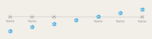
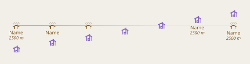
Here a few examples of POI rendering with the new system. First in the symbol and label separate version (similar to OSM-Carto, but with consistent priorities):
 AC-Style with separately rendered symbols and labels
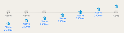
and in the combined version:
 AC-Style with combined symbol and label placement
Note in this second variant, if the combined shield symbolizer (symbol+label) is not successfully placed, the symbol only variant is tried. And if that fails a centered label is tried as well (second from the right). This looks a bit like the third form the right in the separately rendered version with the offset label and the symbol of two different features being shown together in a misleading fashion. Note, however, here the symbol and label are both centered on the respective POI locations, hence this is much less misleading.
You can also see the differentiated formatting of the label with the elevation values in italics. The CartoCSS code for that (requiring – as indicated – a patched version of Carto) is
shield-name: '[name]<Format face-name="Noto Sans Italic" size="9">[int_elevation]</Format>';
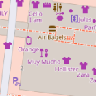
Another example which i derived from real world data i mentioned as a good example of how the inconsistent prioritization leads to confusing results in OSM-Carto. The data around there has meanwhile changed so the map on osm.org does not show this any more – and i made some adjustments to serve better as a demonstration.
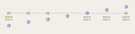
First how it looks like in OSM-Carto. This is a sequence of samples as you zoom in from z15 to z19. The peak on the right gives you a sense of the change in scale.
At z16 you can see the hut symbol vanishes because it is blocked by a picnic site symbol – which starts being shown at z16 with higher priority than the wilderness hut, which was already visible at z15. The hut label remains because it is rendered independent of the symbol. At z17 both the picnic site symbol and the hut label get blocked by the newly appearing fire pit symbol, which continues to block the hut label (but not the symbol) at z18 – while the tower symbol appears. At z19 hut, picnic site and fire pit are all visible – plus some other minor symbols – while the tower symbol vanishes, being blocked by the newly appearing map symbol. And the tower label appears newly at z19 while the corresponding symbol vanishes – adding further to the confusion.
I admit this is a bit engineered for demonstration – though not that much – the original mapping in 2022 already contained many of the flaws this demonstrated. So these are not extremely rare corner cases, these are things happening in the map all the time.
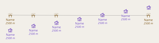
Lets see how the new setup in the AC-Style deals with this. First the variant with separate symbols and labels:
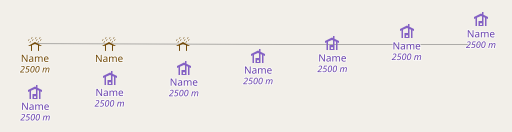
And second – for comparison – the variant with symbols and labels rendered together.
As you can see there are no vanishing symbols in either variant any more as you zoom in. And labels vanish in the first version only. But tying the labels to the symbols of course leads to less symbols being shown because they are blocked by labels. This is only a small factor in this specific test example, practically the effect is often quite significant.
Summary
What i showed here is – as already indicated in the beginning – not a solution to the core problem of combined point symbol and label placement in maps. That would require support from the underlying rendering framework. It does, however, demonstrate how consistently prioritizing labels and symbols by starting zoom level can lead to a much improved map viewing experience with less inconsistencies and how such consistent prioritization can be ensured automatically in a Carto+Mapnik based map style.