Writing about the spectral sensitivity of the Sentinel-2 satellite system and the implications this has for images generated from it i realized a broader discussion of the matter is in order. Creating images with realistic colors is one motive for launching earth observation satellites with visual range sensors but in most cases the data of course is also meant for deriving information about the earth surface from it by means of quantitative analysis. While these two goals are not mutually exclusive they put different requirements on sensor design. Here a plot showing the sensitivity ranges of some earth observation satellites. I focused on currently operational and planned future non-commercial systems (with the exception of Landsat 5 which i included for reference) but this is of course ultimately an arbitrary selection.

You can see the trend from Landsat 5 to Landsat 8 of widening the gap between red and green which is taken even further by Sentinel-2. The DSCOVR EPIC instrument takes this to the extreme although this is not a typical earth observation satellite of course. MODIS and VIIRS have both fairly broad red bands but fairly narrow green and blue sensitivities, something you can notice when dealing with MODIS imagery for example since blue and green tones tend to be fairly strong and glaring.


On top of the plot you can see three instruments not yet launched but planned for this year. The first Sentinel-3 satellite is scheduled to be launched in the next days. These satellites are all in the moderate resolution area similar to MODIS and VIIRS. They generally provide fairly narrow spectral bands but more of them opening up the possibility for improved visualizations by combining bands.

Now the question is of course how would the ideal sensitivities look like for the purpose of creating realistic color visualizations. This is not an easy question to answer. Approximating the sensitivity curves of the human eye is generally not the best approach, you don’t gain anything from having significant overlap of the sensitivities. For Bayer pattern digital camera sensors this matter has been analyzed quite in depth but the situation is different for satellite sensors of course and it will further vary depending on if pansharpening with a higher spatial resolution channel is involved. But of course ideally there should not be significant gaps in the sensitivity across the visual range.

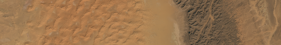
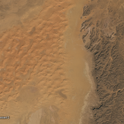
The sample images i have shown above are from the Sahara desert where red tones dominate. The red color comes from the presence of iron-3-oxide and hydroxide. Iron oxide minerals generally feature low reflectivity at short wavelengths and high reflectivity in the red to infrared range. These minerals vary in exactly where the transit from low to high reflectivity occurs and these differences are lost to sensors with a significant sensitivity gap in the green-red range but practically the color nuances in the Sahara are less caused by differences in the iron mineral types but more by varying iron oxide content and varying presence of other minerals, often with more uniform reflection characteristics in the visual range, and dark desert varnish.
What you can generally observe when the red sensitivity is at relatively long wavelengths only where the sensitivity of the human eye is already significantly reduced like in case of Sentinel-2 is an over-emphasis of iron oxide caused red tones. In regions like the ones shown here where these occur uniformly across the whole image you can quite well compensate for that by reducing weight of the red channel – in photography you would consider this a white balance correction. But in areas with more neutral colors with uniform reflection across the green-red range such a measure would in return lead to a bias towards green and blue.