
I have – after many years – made an update to the generalized map rendering demonstration on maps.imagico.de. Since i have first shown this demo i made several improvements to the underlying generalization processes, some of which i have discussed here on this blog in the past. But running all of these processes on a global level in a synchronized fashion is always a lot of work. For good results the different components shown in the map – rivers, lakes, coastlines, glaciers, builtup areas and relief – need to be be harmonized in processing with the others.
In addition to the various improvements made over the years i put some more work into improving the relief generalization methods for small scale applications. Here a comparison of the raw relief shading with two different generalization parameter sets at z6.
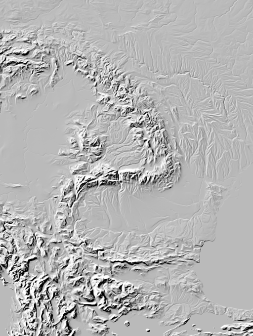
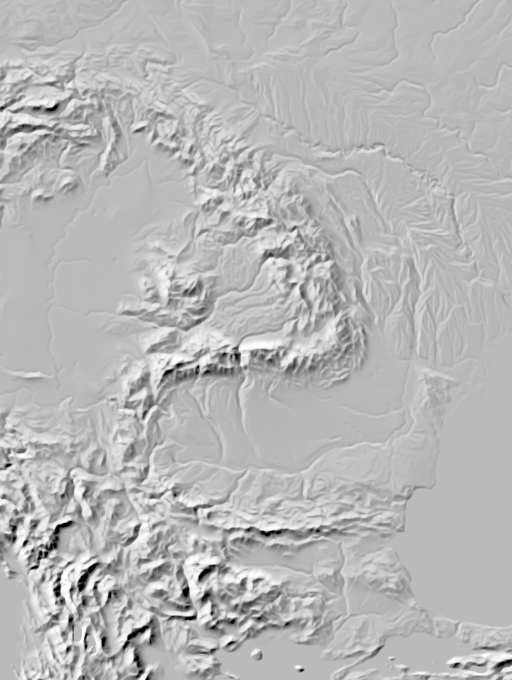
Two different relief generalization parameter sets for comparison
The waterbody depiction is – as discussed before – based on a detailed analysis of the global river network. Here two visualizations of that to give an idea. The selection and rating of river segments to show at a certain scale is based on that analysis.

Water network analysis for Europe and western Asia – click for larger area

Detail of water network analysis in France – click for larger area
Data processing is available up to zoom level 10 for the waterbodies – for the glaciers and builtup areas also further. For regional subsets i have done the water network analysis and processing also up to z13. The demo map is now extended to zoom level 8 – previously it went to zoom level 7 only. Here a few examples with links to the interactive map.
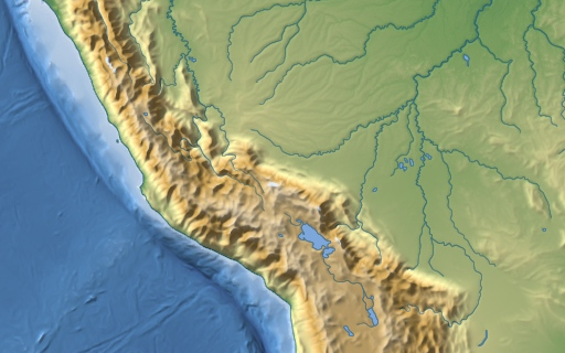
Southern Peru with topography style at z5
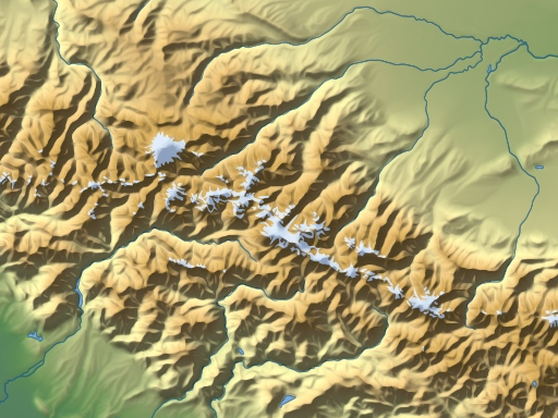
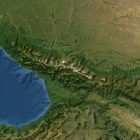
Caucasus mountains with topography style at z8
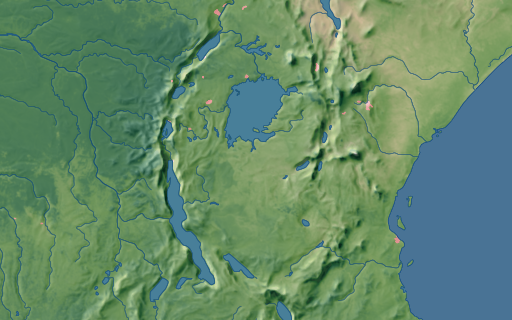
East Africa with landcover style at z5
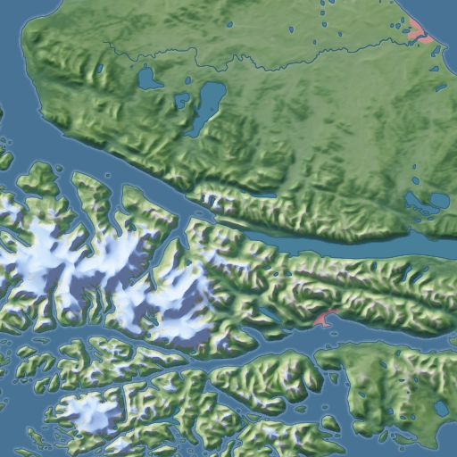
Southern Patagonia with landcover style at z8
So far i only updated the Mercator map in the landcover and topography layers. Other layers and maps will be updated if time is available.
Satellite image with bathymetry shading
In addition to the updates of the generalized map rendering demonstration i have worked on a variant of the satellite image layers with bathymetry depiction instead of ocean color rendering. This kind of rendering is fairly popular in interactive maps you can find in various popular map services.
The origin of that trend is that satellite image mosaics tend to not provide a good quality water depiction. My Green Marble is essentially the only currently available product on the market that provides a global ocean depiction suitable for high quality visualization. To avoid having a lot of empty space in their satellite image layers the map producers opted for depicting the bathymetry – for which data was and is routinely available. How exactly the bathymetry is rendered varies (and this is actually an interesting topic to study). But in principle this idea, which was originally born out of the quandary of having no good image data, turned out to be something that can be made to work quite well.
The main difficulty with that is where to draw the line between the bathymetry depiction and the optical imagery shown for land areas. If you use some coastline mask for that you end up cutting away meaningful imagery – for where the coastline mask is inaccurate as well as for tidal and shallow water areas like reefs where the image data is meaningful. To deal with that most popular map services use a manually drawn mask – which sometimes can be a bit curious in the arbitrariness of choices made.
I have the advantage that with the Green Marble i have high quality data for the oceans that allows me to transit from optical imagery depiction to bathymetry rendering based on globally consistent objective criteria. I have produced two variants of this – one with and one without sea ice depiction. Both can now be studied in the demo map.
Also here a few examples of selected areas with links to the interactive map.
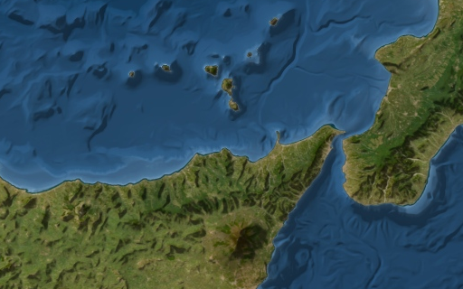
Sicily in Green Marble with bathymetry depiction
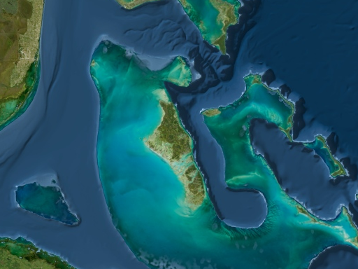
Bahama Banks in Green Marble with bathymetry depiction
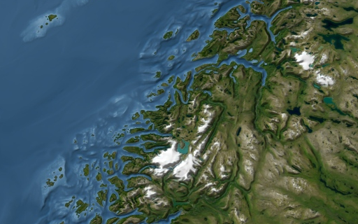
Norway coast in Green Marble with bathymetry depiction
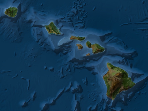
Hawaii in Green Marble with bathymetry depiction
All of these are available for licensing and for producing custom visualizations and custom data processing using the techniques demonstrated. Contact me if you are interested.
Pingback: weeklyOSM 671 – weekly – semanario – hebdo – 週刊 – týdeník – Wochennotiz – 주간 – tygodnik