
After introducing the Landsat mosaic of Germany and the Alps recently i am happy to announce the availability of a similar image from the other side of the globe, the Antarctic peninsula.

Compared to the parts of the Antarctic where i previously showed images for the Antarctic peninsula is more difficult due to the much more variable weather conditions. It took 171 Landsat scenes to assemble this but gladly nearly all could be selected from the Landsat 8 collection (which is of both higher quality and easier to process) – only 16 Landsat 7 scenes were used to fill some smaller gaps primarily on the South Shetland Islands. The ocean areas far away from the coast where no Landsat images are available are filled with the Green Marble image.
In most satellite image layers of map services you find today you see the LIMA for the Antarctic which has been assembled in 2007 mostly from Landsat 7 images from 1999-2003 – here two samples from my new mosaic and the LIMA in comparison:


Apart from the more than ten years newer data basis you can observe the following differences:
- Coloring is much more balanced and consistent. As in my other Landsat image assemblies i try to resemble the ground level appearance. The tone mapping is designed to show both details in the bright snow areas and in the darker parts like snow free areas and shadows. Of course this can be varied to for example better work out subtle shading differences on the snow covered parts.
- The pansharpening used in the LIMA to supplement the lower resolution multispectral data with additional details from the panchromatic channel is fairly noisy and contains a lot of artefacts. This severely limits display of fine details – see the full size version of the first LIMA example above for this.
- The LIMA – despite being assembled with cloud cutting – contains many areas with significant cloud cover visible. I do not claim my mosaic to be fully free of clouds but there are much less than on LIMA. If you have ever worked with satellite images of the Antarctic you will know that clouds can be extremely difficult to spot, both for the human observer and for automatic tools. So there are a few smaller spots, especially cloud shadows and thin veils, that i missed in screening.
- Positional accuracy of the individual scenes is much better leading to less mismatch between them.
- There are no overexposed bright snow areas.
Several different versions of the LIMA exist and are used in various maps including some that were locally supplemented with additional data later. You can see this for example in this map comparison showing the same area as in the second example above (note the different map projection, so different orientation).
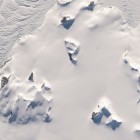
Here another two examples from the new image:


Since the mosaic has been assembled from images from just two summer seasons mostly and both the 2013-2014 and 2014-2015 summers were not extremely warm with quite a lot of sea ice persisting throughout the summer there are significant areas of sea ice visible that are otherwise ice free in many years. This applies for example to the channel between Adelaide Island and the mainland, the southern part of Marguerite Bay and the Prince Gustav Channel on the eastern side.
If you are interested in using this mosaic you can find it on services.imagico.de. Also if you’d be interested in having this image extended to cover the full Antarctic and would be willing to finance the production get in touch.