In the previous post i discussed how a relatively simple feature addition to Mapnik called anchors, which allows conditionally connecting the rendering of some visual elements to that of other elements in the map in a freely customizable way, can help solving the basic dilemma of combined symbol and label visualizations of point features.
But these anchors are useful for more than that – among other things for augmenting symbols.
I have already demonstrated augmented symbols in the past in a very rudimentary fashion for water features with a drinking water attribute. The technique as shown there was rather limited and essentially this was just a basic proof of concept for the visual design idea.

rendering of water sources introduced back in 2018
Augmenting symbols with anchors
The idea of symbol augmentation is that you have a pictorial/geometric symbol in the map visualizing a certain point of interest and that you add a supplementary design element to that symbol to illustrate either additional attributes of the feature in question or to provide information about other data in the geometric context.
The difference to a symbol variation, where you vary the symbol used from a common base design – like it is shown for example in the example above for intermittent and hot springs – is, that symbol augmentations are optional, they are rendered only when there is space for them and the non-augmented symbol, while providing less information, still illustrates the fundamental nature of the feature in question.
The idea with the water POIs is to indicate that a spring/well/fountain provides drinking water with a supplemental beaker symbol, as it is used also for the generic primary tag amenity=drinking_water (see above).
In many cases the design of base symbol and augmentation allow for a number of different relative placements – which can be prioritized based on where other symbols block space – as shown here:
or based on other geometric context – like in case of connected springs:
Technically, a number of things are necessary to make this work well and be flexible in terms of symbol design:
- Priority of the augmentation needs to be adjustable independent of the base symbol.
- Overlap of the augmentation and base symbol needs to be possible without blocking.
- It needs to be possible to specify the relative placement of the augmentation in all the variants precisely.
- It needs to be possible to use different symbol designs in different relative placements.
Existing possibilities in Mapnik do not provide the means for this. How anchors can be used to accomplish that i will show in the following.
Like with the symbols and labels rendering, the base symbol is rendered with
marker-anchor-set: '[osm_id]';
The rendering of the beaker symbol in a separate lower priority layer naturally in the first placement variant gets the already known
marker-anchor-cond: '[osm_id]';
but in addition also
marker-allow-overlap-anchor: '[osm_id]';
marker-anchor-set: "'dw_'+[osm_id]";
marker-allow-overlap-anchor is a selective allow-overlap, meaning that rendering allows overlaps of this symbol with any already rendered symbols with the specified anchor. The second line sets another anchor for the augmentation symbol. This is then used as a condition in subsequent placement variants:
dir2/marker-anchor-cond: "[osm_id]+',!dw_'+[osm_id]";
dir2/marker-allow-overlap-anchor: '[osm_id]';
dir2/marker-anchor-set: "'dw_'+[osm_id]";
This means that rendering of this second placement variant is conditional to (a) the successful rendering of the base symbol and (b) the first placement variant of the augmentation symbol not having been successfully placed.
In addition, for connected spring rendering, the SQL query sorts the different placement variants in priority based on the direction of the connecting waterway – resulting in the behavior illustrated above.
Here a few real data examples illustrating how this looks practically:
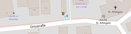
Well at z19

Well at z18
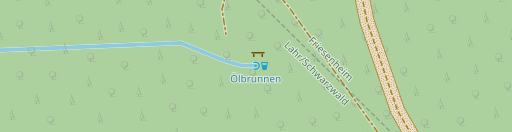
Connected spring at z19
Fountain at z19
Aggregating features with augmented symbols
That was how symbol augmentation can be implemented with anchors in the very simple case that the augmentation visualizes exclusively a certain secondary tagging on the features in question (amenity=drinking_water or drinking_water=yes on natural=spring/man_made=water_well/amenity=fountain). I will now show and explain how this concept can be extended to aggregate different close-by and semantically connected features.
The case i want to demonstrate this on is bus stops and shelters. Bus stops in OpenStreetMap are tagged with highway=bus_stop. If the bus stop has a shelter for protection of waiting passengers against the weather this can be tagged with
- a separate feature (node or polygon) representing the shelter tagged
amenity=shelter(optionally withshelter_type=public_transport) - or a secondary tag
shelter=yeson thehighway=bus_stopnode - or both
In many cases the bus stop and the shelter are very close to each other so there is no room at the lower zoom levels to render both with a dedicated symbol without displacement of either. In OSM-Carto in addition amenity=shelter has priority over highway=bus_stop in rendering so you see a lot of shelters but not a lot of bus stops at z16/z17.
A viable solution is again to use symbol augmentation. Here is how this looks like at z16:

From left to right: (1) amenity=shelter (2) amenity=shelter + shelter_type=public_transport (3) highway=bus_stop (4) highway=bus_stop with either shelter=yes or separate amenity=shelter nearby
and at z17 and above:
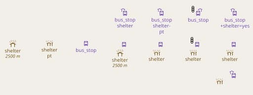
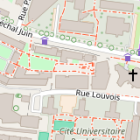
Bus stop rendering with augmented symbols at z17 and above – see text for detailed explanation
From left to right this shows:
amenity=shelteramenity=shelter+shelter_type=public_transporthighway=bus_stophighway=bus_stopwith separate node taggedamenity=shelternearbyhighway=bus_stopwith separate node taggedamenity=shelter+shelter_type=public_transportnearbyhighway=bus_stopwith separate node taggedamenity=shelter+shelter_type=public_transportnearby and nearby other symbol blocking default placement of symbol augmentationhighway=bus_stopwith secondary tagshelter=yesand with separate node taggedamenity=shelter+shelter_type=public_transportnearby
The last four are shown on top with the shelter node so close that there is no space for both symbols, hence resulting in the augmented symbol rendering, and on bottom with the shelter node far enough away for a separate rendering. In the last variant on the right this version shows the non-augmented bus stop symbol because the shelter is close enough to be recognized as the shelter of this bus stop explicitly representing the implicitly tagged shelter=yes – while in the third variant below, the shelter node is so far away that it is no more recognized as belonging to the bus stop – hence the shelter=yes leads to the augmentation.
Implementing this with anchors in Mapnik requires the query for the add-on symbols to provide both the osm_id of the bus stop and that of the closest nearby shelter (as osm_id_shelter). This is then used for the first placement variant of the augmentation symbol like
marker-anchor-cond: "[osm_id]+',!'+[osm_id_shelter]";
marker-allow-overlap-anchor: '[osm_id]';
marker-anchor-set: "[osm_id]+'_'+[osm_id_shelter]";
meaning to
- only render the augmentation symbol if the base symbol has been successfully rendered and if the standalone symbol for the shelter has not. For only implicitly mapped shelters, osm_id_shelter is set to zero so this second condition is always met in those cases if no explicitly mapped shelter is nearby.
- Allow the augmentation symbol to overlap with the base symbol.
- Set a new anchor concatenating the bus stop id and the shelter id.
For the second placement variant (augmentation on the right) the anchor condition is then obviously extended to
alt/marker-anchor-cond:
  "[osm_id]+',!'+[osm_id_shelter]+',!'+[osm_id]+'_'+[osm_id_shelter]";
meaning that this marker is only rendered if
- the corresponding base symbol has been successfully rendered,
- the shelter has not been successfully rendered as a standalone symbol,
- the previous placement variant(s) have been non-successful
Why do we include both the bus stop id and the shelter id in the anchor? Because we want the same shelter to potentially serve for several bus stops and they need to have different anchors in both augmentations for that to work. For bus stops this is practically not a common arrangement but for tram stops and railway halts this is quite common when both directions of transport share a common platform with a single shelter (the 2+1 variant below).
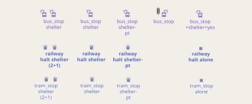
Augmented symbols for railway halts and tram stops
And here finally a few example of how this looks like with real world data.
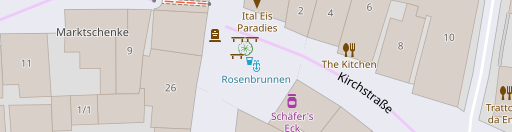
Bus and tram stops in Strasbourg at z16
Bus and tram stops in Strasbourg at z17
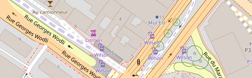
Bus stops in Strasbourg at z18
Conclusion
What i showed here is how symbol augmentation can be used as a technique to transport additional information in a map in an intuitive way in cases where space is scarce and there is not enough room to depict everything through atomic and static point symbols. Doing this in a proper way requires support from the rendering tools and i demonstrated how the low level feature of anchors i added to Mapnik can help with that.
As mentioned in the previous post already these anchors implement only part of point 5 in my list of features map design would like to have from the tools it uses. At the same time what i showed in this and the previous blog post barely scratches the surface of what can be done with this relatively minor additional feature. This should give you a bit of an idea how we are in automated rule based map design – figuratively speaking – barely at the threshold towards the Neolithic.
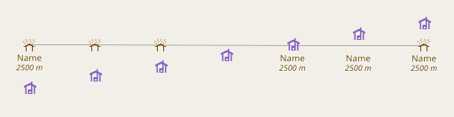
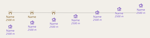
 AC-Style with separately rendered symbols and labels
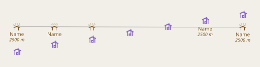
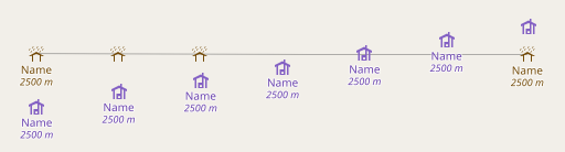
 AC-Style with combined symbol and label placement
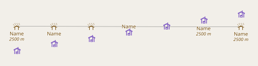
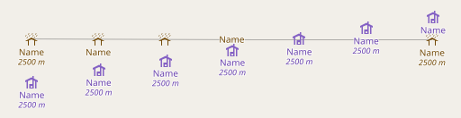 separately rendered symbols and labels connected via anchors