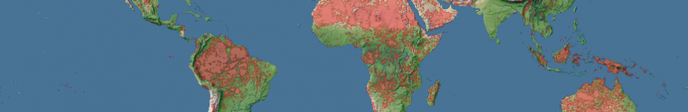
When processing the building and road data for the generalized human settlement areas i realized there are a number of other interesting things that can be done with this data. For example it is quite easily possible to determine which areas on the planet are within a certain distance of a road or buildings based on this. The following map has marked in red all land areas which are more than 10 kilometers from a road or building according to the OpenStreetMap data.

Of course the OpenStreetMap building and road data is far from complete so some of the areas marked in red in the above map are not really all that far away from actual buildings and roads, they are far away from them as far as they are mapped in OSM.
The interesting thing is however this is actually quite a good measure for where OpenStreetMap is worst. Not necessarily worst in the sense of least or least accurate data, actual data quality varies strongly in the red areas, but bad in the sense that the way OpenStreetMap works actually works quite badly here. The primary mechanism how data is generated in OpenStreetMap is by people mapping what is around them. Since this is first hand information and people mapping verify and fix each other’s work by comparing with their own observation the data is usually quite accurate and up-to-date – as countless comparisons with conventional map data have shown. This mechanism however breaks down in areas where no or only very few people go and map based on first hand observation. These are either areas which are difficult to access, i.e. truly remote areas, or areas where people have little interest in going and mapping and which are therefore not well mapped. The red areas shown in the above map are a mixture of both.
Very little of the OSM data in those areas is based on classical on-the-ground first hand mapping. The primary methods how existing data in OSM in those areas is acquired are:
How good the data is in these areas depends mostly on how well these two methods have been used. The main problem is that in contrast to the classical on-the-ground mapping there are no established and working mechanisms for quality control and verification. Quality of the data depends much more on how diligently the remote mapping and data imports are performed. The problem is this relies strongly on the work of the individual mappers. Of course it is not that in the other parts of the world there are no quality problems and errors due to bad mapping but elsewhere these are less likely to prevail for a longer time than in remote areas.
The way to improve this situation is quite clearly to get more people to work on these areas. For this to work in terms of quality control like it does in the higher interest regions however it is essential that people mapping use independent data sources. Having a hundred mappers work on some region based on the same aerial images or same external data sources is not likely to improve the data quality much, the mappers will likely interpret the source data in a very similar way including the same misinterpretations. The key to good quality mapping without first hand on-the-ground observation it to have many different and independent data sources.