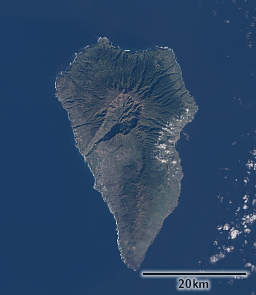
I found a useful pair of scenes from Sentinel-2 and Landsat-8 from the same day which i would like to use to discuss a few more points. This kind of turns the originally planned two part post into a four part series.
The images are from the western Canary Islands and were taken on December 31, 2015 about 20 minutes apart with about two degrees difference in sun elevation. Here the island of La Palma on both images processed identically:
You can clearly notice the difference in ocean color which seems to be the result of a minor difference in radiometric calibration with what in photography you’d call the black point definition – i could be wrong about this of course but it seems a plausible explanation. It is clearly not a problem due to non-lambertian characteristics of the water – land areas are equally affected as visible in the shadows. I already observed this in images previously reviewed but always thought this was due to differences in atmospheric conditions (which is unlikely to be the case here with only 20 minutes difference and the difference being very uniform across the whole image) If i try to compensate for that the difference can be eliminated quite well:
There is no way to say which one is wrong here, Landsat or Sentinel-2, but given the banding issues with Sentinel-2 i mentioned i have slightly more confidence in the Landsat data. Ultimately for visualization it does not really matter.
When you look at the images more closely in comparison you can get a hint of how the narrow red and green bands from Sentinel-2 influence the resulting image. Here a full size crop with the Landsat image upsampled to match the 10m resolution:
If you look at the uniformly green plantations – in the strongly structured built up areas you have much stronger color mixing in Landsat-8 due to the lower resolution of the color data so this cannot well be compared – you see the Sentinel-2 image shows significantly stronger colors. This might appear to look good but keep in mind these images are not atmosphere compensated. If you’d approximate a surface reflectance image based on this you will likely get unrealistic colors. This is one of the likely side effects of the sensor bands being much more narrow than the human perception. You can of course also phrase this in a positive way – the satellite is able to see nuances in strong colors the human eye is no able to distinguish.


