
As already pre-announced this is part 2 of a two part report on my first experiences with the data from the ESA Sentinel-2 satellite which is now available publicly. Part 1 was about downloading and accessing the data in general, this part is about actually using it, i.e. dealing with the images. There is an addon to this second part with additional information and i am also going to make a third post on the matter with some remarks on the overall tally of Sentinel-2 vs. Landsat.
Addition to part 1
First a quick addition to the first part. I mentioned the difficulty of reading anything useful from a Sentinel-2 data package name without looking into the package itself. The API offers a solution for this. By querying
you get an XML containing among other things the UUID for downloading the package, its quicklook image etc. and which also contains the (inaccurate as mentioned) footprint of the data as GML.
Accurate footprints of the covered areas are available within the package by the way – separately for every band as GML files, for band 2 for example for one of the tiles you have
S2A_OPER_PRD_MSIL1C_PDMC_20151230T202002_R008_V20151230T105153_20151230T105153.SAFE/GRANULE/S2A_OPER_MSI_L1C_TL_SGS__20151230T162342_A002722_T31TFJ_N02.01/QI_DATA/S2A_OPER_MSK_DETFOO_SGS__20151230T162342_A002722_T31TFJ_B02_MSIL1C.gml
The image data
You have selected and downloaded a scene package hopefully containing the area you are interested in based on the somewhat inaccurate footprint and possibly the small preview image as explained in part 1. The package contains about 13 tiles (called Granule by ESA) so you have two options: assemble these tiles into one single, fairly large file and use it or find out which tile you are actually interested in and process only that. Which way works best for you probably depends on what you want to do with the data. Getting a reference map for the MGRS tiling will probably help. Be careful though – they seem to have their own interpretation of the MGRS system that differs from the original definition. In particular it seems they extend the UTM coverage towards the south pole and not switch to the polar projection there. Overall their tiling system more or less breaks down at high latitudes – the tile overlaps and multiple projections per scene lead to quite extreme redundancy between tiles there – here an example from the Antarctic with an actual coverage of just slightly more than two tiles which gets blown up to three whole and eight partial coverage tiles:

It seems the scene package also sometimes contains a larger and non-split preview of the scene by the way that can help you to better assess the scene quality:

But this is not always the case (although this might be due to the preliminary status) and it does not always match the actual data.
Interestingly the scene metadata also contains a link for this preview which is not working but looks like a WMS. This link also contains a layer name that looks like a scene ID: S2A_A002722_N0201 – without any timestamps as used for the package file names. You can also find this in the image file names in the packages together with a timestamp which of course then seems redundant.
You can also find a reduced size rgb preview of the tiles in the respective QI_DATA directories, like:
S2A_OPER_PRD_MSIL1C_PDMC_20151230T202002_R008_V20151230T105153_20151230T105153.SAFE/GRANULE/S2A_OPER_MSI_L1C_TL_SGS__20151230T162342_A002722_T31TFJ_N02.01/QI_DATA/S2A_OPER_PVI_L1C_TL_SGS__20151230T162342_A002722_T31TFJ.jp2
which is likely helpful to verify if a certain tile contains the area you are interested in. In general all these preview images, especially the quicklooks and thumbnails available on the web are often of limited use due to the poor contrast compression. The USGS uses false color infrared images here which bring a generally somewhat lower dynamic range from the start but which have their own disadvantages (like the difficulty to assess atmosphere clarity from them). The RGB channels with their strong contrasts would require significant contrast compression to equally show dark forest areas and bright snow and ice.
Now to the data itself – the band designations can be found here, the exact specifications here. Like with Landsat-8 rgb images can be assembled from channels 4-3-2. You can do that with my old ls2rgb tool.
What you get when you do that for a single tile is something like this:

which does not look unlike a raw Landsat image.
Resolution
As you probably know Sentinel-2 offers a 10m resolution in the visual color bands in contrast to Landsat with 30m resolution and 15m in a single panchromatic band. Let’s see how this difference looks like in reality. Here a full resolution crop from the Sentinel-2 image:

And here for comparison a recent Landsat scene of the same area (LC81960302015313LGN00), pansharpened and upsampled to 10m resolution:

Now the comparability is of course limited – different dates, different atmospheric conditions – but you can clearly see the resolution difference, especially in the urban area in the middle where you can see the color differences between the reddish roofs and the green vegetation and gray streets while in the Landsat image you get a very uniform color and only some brightness differences on the small structures. This is an obvious advantage of having high resolution multispectral data.
It has to be considered on the other hand that for producing color images like this having a high resolution panchromatic channel and color data only in lower resolution is more space efficient. If Landsat for example had twice the linear resolution (15m rgb and 7.5m panchromatic) the overall data volume would be similar to that of Sentinel-2 data (for 10m rgb only) and you would be able to see smaller details in the resulting imagery. For quantitative analysis on the other hand the panchromatic data is of course often less useful.
Other quality aspects
Pixels outside the data coverage are zero. Scene edges are generally clean although in areas with articulated relief i observed some edge artefacts (that is non-zero non-valid pixel values) in several scenes like here in the Antarctic but also in the Alps:

The data quality and noise levels of the individual pixels seems to be comparable to Landsat-8 which means it is very good. Shadows are well articulated like in the following examples from the Antarctic:

and the Alps:

What seems slightly worse than with Landsat-8 are banding artefacts caused by the different sensor modules making up the image sensor. With Landsat these are usually only visible in extreme situations like with sun glint or in extreme shadows as in the recently shown sunrise image. For Sentinel-2 here an example from the Mediterranean:

Practically this is rarely a problem for visualization purposes, you can only see this with very smooth areas like water surfaces.
I have not looked in depth at a lot of things regarding quality, especially not at the various new bands but a few general observations i have made:
- Positional accuracy: this is quite clearly similar to Landsat although i have not looked at a sufficient number of images to make a proper assessment. According to ESA they use SRTM based relief data for correction. In the Antarctic i compared Sentinel-2 images with my Landsat mosaic of the Antarctic peninsula and it seems the mismatch tends to be larger towards the edges of the Sentinel-2 swath with differences up to more than 100m on occasion. This is of course just a vague impression since Landsat imagery is not very well aligned here either. I mentioned in my comment on the Sentinel-2 launch that the larger viewing angle might lead to less positional accuracy and in areas with articulated relief terrain correction will be the limiting factor, especially at the outer parts of the swath. If i’d have to guess i’d say in flat areas Sentinel-2 might be slightly more accurate than Landsat although this is really a very rough guess without proper basis.
- Color accuracy: in my first post about Sentinel-2 i mentioned the red and green bands are much more narrow than the human vision sensitivity meaning there is a considerable spectral range between red and green where Sentinel-2 has no sensitivity but the human eye has. This could lead to color distortions. How this manifests in reality is not easy to say. I did some comparisons of Landsat and Sentinel-2 images and i think it is possible to see a difference in color rendering or in other words with some more experience it will likely be possible to determine which satellite an image is from based on the way colors are rendered. The difference is subtle and not easy to describe – the Sentinel-2 images seem to have a somewhat more glaring appearance in red and green tones. I don’t want to show examples because for reliable demonstration you’d really have to use images from the same day and i have not yet identified such an image pair.
In conclusion i can say the Sentinel-2 data is usable and useful although accessing and processing it in a routine workflow is currently difficult. When you consider using this data keep in mind the terms and conditions of data access and use. These are fairly vague and difficult to read. They are based on an EU regulation. It essentially allows free access and free use to everyone – globally, permanently and including commercial activities (which is good) but has a requirement of informing the public of the source in case of public distribution or communication of stuff based on the data.
The specific article of the regulation is:
When distributing or communicating GMES dedicated
data and GMES service information to the public, users shall
inform the public of the source of that data and information.
This is vague but clearly weaker than for example the ODbL attribution requirement. If it is sufficient to have a reference to the source on your about page if you provide a service based on Sentinel data is likely open to interpretation although it’d be difficult to argue that it is not.
Another thing that is unclear is if the data will be permanently offered so you can access the full archive of images in the future or if this is just delivery of the newest images and you’d have to maintain your own archive to be able to also access older images in the future. My guess is that the EU commission and ESA have not really thought that far. The costs of permanently making available the full archive will of course be significantly higher although they probably do this anyway for their institutional partners. My reading of the mentioned regulation is that the promised free, full and open access can only mean permanent availability of the data, especially since the aims of the whole program specifically include climate change monitoring which obviously requires access to the full archive.
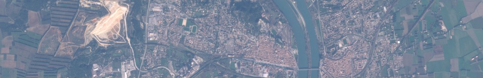
For wrapping up here another image from Libya from the city of Benghazi:

February 1, 2016 at 08:52
Great post!
Have you managed to use gdal on the Sentinel granule files? I am able to do a gdalinfo but not a gdal_translate. I get
0error: cannot decode code stream
ERROR 1: S2A_OPER_PRD_MSIL1C_PDMC_20160129T004915_R140_V20160128T161526_20160128T161526/S2A_OPER_MSI_L1C_TL_SGS__20160128T182815_A003140_T17SMT_N02.01_B04, band 1: IReadBlock failed at X offset 0, Y offset 0
ERROR 1: GetBlockRef failed at X block offset 0, Y block offset 0
It works for other jp2 file, so I guess there is something a little peculiar with the Sentinel ones…
Any pointer would be very much appreciated.
Thanks!
February 2, 2016 at 09:50
No problem with reading the files in general here – i have had the occasional corrupt file but normally these read just fine.