I have been meaning to write a piece about this for some time already and a post on the OpenStreetMap user diaries reminded me about that. Recent changes in the distribution form of Copernicus Sentinel-2 images – which I wrote about in relation to other aspects previously – also introduced something I did not write about yet – the full resolution True-Colour Image. I did not discuss this because it was not of much concern for me. I disliked the additional download volume but otherwise this would not cause any problems. Later I however realized that for many beginners in using satellite imagery this will probably have a much higher impact because they will often be inclined to actually use it and might even view the data exclusively through this image.
The True-Colour Image is essentially a large, full resolution version of the preview images you can find in the ESA download application and can also query through the API. I made critical remarks about the rendering of these previews before and those essentially apply to the full resolution version the same way. The developer who planned and implemented generation of these images quite clearly did not know much about either satellite imagery or color representation in computers in general on the current technical level.
What today’s satellites – including Sentinel-2 – produce as raw imagery is pretty high quality data, not only in terms of spatial resolution but especially also in terms of dynamic range and low noise levels. Even if you just look at the true color channels, i.e. red, green and blue, this data cannot be fully reproduced on a computer screen, you need to compress the dynamic range available into the range supported by computer displays. Doing this is not a simple task, it requires knowledge of color representation, image processing and color physiology and ideally it takes into account what you want to use the image for. Still the way this is done with the Sentinal-2 True-Colour Images is about the worst possible way this can be done. Not only does this immensely reduce the usefulness of these images for the user, it also significantly sells short the quality of the underlying data.
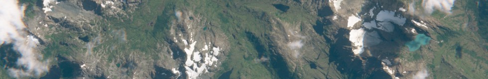
Here an example from Patagonia near the southern tip of South America:

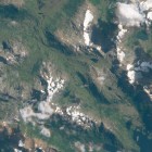
For comparison a custom rendering produced by me from the raw data:

Clearly visible are the clipped highlights in the first image which makes it hard to distinguish clouds from snow and the fairly structure-less shadows where you can hardly see anything. Both of these are not problems of the data but of the processing applied – as evident in the custom rendering.
Now you might say that it is obvious when you compare a static processing with one specifically adjusted for the setting but this is not the point here – you can do much better even with a globally uniform rendering applied to all images identically. And using the poor rendering of the color composite images in the Sentinel-2 packages you loose a lot of valuable information that is actually in the data. Or to look at it from a different perspective – apart from the higher spatial resolution you could produce this kind of rendering also from a 1980s Landsat 5 image.
The color fringes around the clouds are not a processing artefact by the way but due to the way the satellite records images.