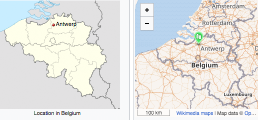
Came across this remarkable map comparison today – click on the image to get to the source:
Note i re-touched the image to make it look a bit more like it is meant to look – see the description of the image after following the link. This however is not completely accurate – you need to ignore the different label languages.
I find this a fairly educative and thought provoking example on several levels. You have the general concept of the map (static vs. dynamic in user interaction), you have the underlying technology to produce the map and you have the map design. And above all of this you have the purpose of the map (being a locator map in a Wikipedia article). One obvious thing you for example could ask yourself is why the map on the left looks like it does and why does the map on the right look like it does – in other words: what are the reasons and motives for the design used here? Since both maps are produced for the same purpose you will probably agree it is somewhat odd they differ that much. Does this have reasons in the static vs. dynamic interaction? Does it have reasons in technology? Is it a matter of changing map design fashion? Or is it something entirely different?
Note i wrote about the economic side of this matter, incidentally also in the context of Wikimedia maps, several years ago. I also wrote about the sociological side of map design in context of OpenStreetMap-Carto more recently. But i still find this a rather intriguing topic with many open questions. If you have additional thoughts and perspectives on this matter i would be curious to read about it in the comments.

August 31, 2018 at 13:56
I strongly suspect that map on the left displays only limited data not because of a deliberate design decision, but because more detailed data was not available on a suitable license.
(sorry for missclick and posting earlier unfinished comment)
August 31, 2018 at 14:32
I don’t know. It is possible that available data (or data available in a suitable form easy to use) plays a role in design decisions here but i would in fact consider this to be likely more extensively the case in the map on the right than in the one on the left.
My impression is that fashion plays a very strong role here – in the sense that deliberate design decisions are made based on perceived expectations how a map of this type is supposed to look like, with this type being mostly defined by the technological basis and less derived from the purpose of the map.
We see this in other domains of design as well – text documents written and typeset in Word for example tend to on average follow a design path very different from documents typeset with TeX, and such design differences tend to go beyond what is inherent to the underlying technologies.