Imagico.de

blog

Maritime farming – displaying aquacultures

June 3, 2025
by chris
1 Comment

Maritime farming – displaying aquacultures

Going further from what i wrote about in the previous post regarding map design for coastal constructions and harbor features, i here want to look into rendering aquaculture installations.

Those have been mapped in OpenStreetMap for a long time with landuse=aquaculture and that tag is meanwhile used nearly 90k times and we have had an open request in OSM-Carto to render those since 2015 when the tag was only used less than 10 percent of what it is used today.

Several ideas for rendering were discussed back then but nothing was developed to a state were it was really suitable for integration into the style. The main difficulties are:

  • Aquacultures produce a wide range of things – like fish and mussels, but also seaweed. Designing a pictorial symbol for generic landuse=aquaculture that covers this full range and is still intuitively understandable is hard.
  • The design needs to reflect that it represents a physical, artificial structure and neither a natural feature (like a reef or tidalflat) nor an abstract area reserved for certain purposes (like a fishing ground)
  • The design needs to ensure that the background is not fully obscured (it needs to be clear that it is water, possibly tidal, in the AC-Style also possibly different types of water), but at the same time overlaps between landuse=aquaculture and natural=reef or wetland=tidalflat need to render in a readable way.

I have now developed a design that in my eyes mostly satisfies these requirements, that i want to show and discuss here now. The basic rendering concept looks fairly unspectacular:

Basic rendering concept for landuse=aquaculture on different water color backgrounds - link goes to double resolution rendering

Basic rendering concept for landuse=aquaculture on different water color backgrounds – link goes to double resolution rendering

Now, it probably seems that the design is too noisy for the lower zoom levels (z9-z10). But keep in mind that aquacultures are typically rather limited in size. And the rendering is size dependent, as you can see in the following illustration.

Design variation based on polygon size

Design variation based on polygon size

This basic design is varied according to the produce cultivated in the aquaculture. Unfortunately, tagging practice here is not very consistent – both aquaculture=* and produce=* are used. The visualization of these variants is done with a single symbol pattern similar to what is used for sport pitches. And, like for pitches, the symbol size is increased if there is sufficient space. While, in case of sport pitches, this was implemented using standard Mapnik compositioning operations, i use GMIC here (because that is used anyway – see below).

Visualization of the cultivated produce using a single symbol pattern

Visualization of the cultivated produce using a single symbol pattern

So, overall, i use the following design elements:

  • A dotted outline in dark blue to clearly mark the extent as mapped.
  • A regular structure pattern to indicate an artificial structure.
  • A single non-blocking symbol in a size adjusted to the polygon size and – if necessary – clipped by the polygon extent. This part is only done if the feature is sufficiently large in display.

This seems relatively plain and simple to implement at first. The difficulty, however, is in the details. If you look closely, you can see, that the structure pattern does not extend to either the outline or the center symbol, it leaves a small gap to those. This is important for readability of both the outline as a perimeter of the geometry and the symbol. If the structure pattern did cover the whole polygon, its dots would reduce the clarity of the rendering of those.

You could try to implement this with standard means in CartoCSS/Mapnik by painting over the pattern with a polygon outline and an outlined version of the symbol in water color. That would, however, defeat the very purpose of why we render this with a partial coverage overlay pattern and a dotted outline: The differentiated display of the water underneath – in particular that different types of waterbody and tidal features remain clearly visible.

Aquaculture rendering in front of differentiated water areas

Aquaculture rendering in front of differentiated water areas

What i did instead is using again GMIC for composing the different layers with the help of morphological processing of the alpha masks. Like with the quay rendering discussed in the previous post the GMIC scripts are wrapped in a conditional, so, if no aquacultures are rendered and the raw rendering buffer of that layer is therefore empty at the beginning of processing, the potentially expensive operations are skipped.

What is different here from the previously explained GMIC scripts is that the buffers that are not needed any more are individually discarded while otherwise i used -keep[name] to keep only the buffer to be used and discard everything else. The reason is that at this stage in rendering there are other buffers on the stack that are still needed later (specifically the water masks used for the quay processing – see the previous blog post).

So far, so good. But you might remember the last difficulty described at the beginning of this post – if the aquaculture is mapped over a reef or a tidalflat, the result would essentially be unreadable because two strongly structured patterns would overlap. The solution here is to cut out the area covered by the aquaculture from the pattern rendering of the reefs and wetlands – again with a small buffer so the outline remains clearly visible. To do this i left the original polygon mask from the aquaculture layer on the GMIC stack (named aquaculture_mask) after rendering the aquaculture layer. The reef and wetland patterns are rendered in the landcover-area-symbols layer, which is rendered after the aquaculture layer. There, the mask is used in the following way:

zoom={round(log2(559082264.028/$_mapnik_scale_denominator))}
-if $zoom>=9
-if $_mapnik_render_trivial
-remove[aquaculture_mask]
-else
+channels[landcover_area_symbols_water] 3 -name. las_mask
-dilate_circ[aquaculture_mask] {5.0*$_mapnik_scale_factor}
-sub[las_mask] [aquaculture_mask]
-to_rgb[landcover_area_symbols_water]
-append[landcover_area_symbols_water] [las_mask],c
-remove[las_mask] -remove[aquaculture_mask]
-fi
-fi
-name. use

This is not very complex – apart from the wrapping conditional that limits the actual use of the GMIC script to z>=9. This is necessary since the landcover-area-symbols layer is also rendered at z<9 and the GMIC script cannot - as explained in the previous blog post - be made conditional through a CartoCSS selector. The actual processing of interest at z>=9 in the non-trivial case happens after the -else and does the following:

  • duplicate the alpha channel of the landcover overlay pattern rendering as las_mask (image 1).
  • dilate (expand) the alpha channel of the plain color rendering of the aquaculture layer (the mask as retained from the aquaculture rendering: image 2, after expansion: image 3)
  • subtract the expanded aquaculture polygon mask from the landcover overlay pattern mask (image 4).
  • replace the alpha channel of the original landcover overlay pattern rendering (image 5) with the the modified alpha mask from the previous step (image 6).
  • remove all the buffers not needed any more.
  • use the modified rendering for composing this layer – the final rendering result is shown in image 7.
The different buffers at the different steps in the GMIC sequence with the numbers referenced above – rendered in double resolution and with bright gray indicating transparent background

The different buffers at the different steps in the GMIC sequence with the numbers referenced above – rendered in double resolution and with bright gray indicating transparent background

Design wise this seems to work reasonably well in the different contexts. The dotted outline of the aquacultures is clearly visible – thanks to the buffered cut-outs of the patterns. And the different patterns do not interfere with each other while the edges between tidal and non-tidal areas and ocean, inland water and rivers remain visible.

landuse=aquaculture on different water color backgrounds, tidal flats and reefs

landuse=aquaculture on different water color backgrounds, tidal flats and reefs

landuse=aquaculture of different types on wetland=tidalflat background

landuse=aquaculture of different types on wetland=tidalflat background

landuse=aquaculture of different types on natural=reef background

landuse=aquaculture of different types on natural=reef background

Conclusions

What i have shown here are examples how more complex raster processing using morphological operations can be used to render different design elements in a map with cut-outs relative to each other. This facilitated solving a long standing problem in OSM based map design with well readable results.

It also shows that, as a map style grows more and more complex, both technically and design wise – with different elements being carefully adjusted in relation to each other, it becomes increasingly complex to add new features without creating a mess at least in some situations. A solid and capable technical framework and means of systematic testing are key to tackling these challenges.

As usual the changes shown here can be found in the AC-Style.

At the waterline - depiction of coastal constructions and harbour features

May 29, 2025
by chris
3 Comments

At the waterline – depiction of coastal constructions and harbor features

OpenStreetMap has – despite its British origin – not a very strong maritime focus. Reason for that is probably that only a small percentage of mappers in OpenStreetMap live in a coastal setting. And even for those who live in a coastal city, everyday life rarely focuses on this aspect.

As a result, tagging of human infrastructure specific to coastal settings is relatively under-developed in OSM. And a lot of tags that have been invented and established over time are not widely interpreted by data users – and when they are, this is often done in a rather undifferentiated way.

I wrote about natural coastal features in OpenStreetMap quite extensively – as well as their depiction in maps. This blog post is going to focus on human constructions in coastal settings and features related to human activities.

Most of the design work i present here was already developed last year. But there were some details that i only found the time to finish recently.

Symbols

Starting point for me is one of the big symbology mistakes in OSM-Carto – the choice of symbol for amenity=ferry_terminal.

amenity=ferry_terminal in OpenStreetMap is used to map a place at the coast where ferries take on or offload passengers. And the term ferry is used very widely in OSM for any kind of water vehicle regularly transporting people between specific locations over water.

amenity=ferry_terminal is OSM-Carto

amenity=ferry_terminal is OSM-Carto (link goes to double resolution version)

In OSM-Carto amenity=ferry_terminal is displayed with an anchor symbol. This is a poor and misleading choice in my opinion since the anchor symbol in cartography in most cases is used for places where ships or boats can anchor or moor – not necessarily regularly and not necessarily for on- and off-loading passengers. The anchor symbol to many map user therefore will imply a certain meaning while de facto it indicates something rather different.

The more intuitive choice of symbol would be that of a moored passenger ship – which is the concept i chose for the AC-Style now.

New amenity=ferry_terminal design is the AC-Style

New amenity=ferry_terminal design is the AC-Style

This is going to appear somewhat off in case of smaller boats serving as ferry. This will, however, not be as grossly misleading semantically as the anchor symbol.

Note there is a subtle difference between the symbol for polygon features and the symbol for nodes: Nodes are rendered with a symbol where the ship has a fill color while the symbol used for polygons is outlines only so the background color shines through – normally in the transportation fill color that is also used for the symbol fill.

Filled symbol for nodes and unfilled symbol for polygons (double resolution rendering)

Filled symbol for nodes and unfilled symbol for polygons (double resolution rendering)

The reason is that the ferry terminal node is often located at locations where several line features meet (coastline, ferry route and whatever road or path leads there). Hence the background is often fairly noisy and the symbol would be poorly readable without a fill. This is less of a problem when the ferry terminal is mapped with a polygon and the symbol is placed somewhere within the polygon.
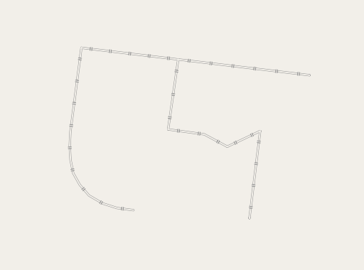
The other symbol change i implemented is the addition of a symbol for emergency=life_ring. This has been a request in the past in OSM-Carto but the difficulty is to design a symbol that, at z19 and in terms of visual weight – relates well to the other small point features shown at that scale (like amenity=bench, amenity=waste_basket). Creating a small enough symbol that is not out of balance with those and that is still recognizable as a life ring is somewhat difficult.

New emergency=life_ring rendering

New emergency=life_ring rendering

Life ring at z19 in context of other small point symbols

Life ring at z19 in context of other small point symbols

Coastal Constructions

The three types of coastal constructions rendered in OSM-Carto

The three types of coastal constructions rendered in OSM-Carto

Piers

Piers as mapped in OpenStreetMap with man_made=pier are walk-able constructions over water, often used to access boats moored to the pier. They can be either swimming or erected on poles above the water. These are traditionally rendered in OSM-Carto in land color – i.e. they appear like land, but with no further indication that they are a constructed feature. That works reasonably well and avoids map users having to understand a separate design element. But it also does not differentiate the display of piers in any way.

The most common additional differentiations of piers in tagging in OpenStreetMap are (a) if the pier is floating (floating=yes) or mounted on poles or other support structures (floating=no) and if the pier is used for mooring boats or ships (mooring=*, most common values being yes and private). I have developed a design to show these with a distinct rendering now:

New rendering of piers differentiated by secondary tags floating=* and mooring=*

New rendering of piers differentiated by secondary tags floating=* and mooring=*

Floating piers are indicated with a dark blue edge line on the water side – which is only shown where the pier is mapped over water. This is relatively straight away to implement with the existing framework to differentiate rendering over water and over land.

Explicitly non-floating piers (floating=no) are indicated with a dark shadow towards the lower right – similar to the one used for planters – and a very thin outline.

mooring=* is indicated with subtle anchor symbols on the pier – adjusted in size to the display size of the pier. This is shown with a single symbol pattern for polygons and with repeating symbols along the line for piers mapped with linear ways – as illustrated here:

Mooring symbols on piers of different length mapped with linear ways

Mooring symbols on piers of different length mapped with linear ways

Also visible in that is that the line width is adjusted based on width=* tagging. Note that if the pier is double tagged as a road or path the name is displayed only for the road and not the pier. In OSM-Carto this is labeled twice.

I also integrated the piers into the road layer so a non-floating pier will be shown above a footway on the beach underneath with the appropriate additional tags applied.

Layering of piers in OSM-Carto (left) and in the AC-Style (right)

Layering of piers in OSM-Carto (left) and in the AC-Style (right)

Breakwaters

The second water edge construction rendered in OSM-Carto is man_made=breakwater. The tag is used in OpenStreetMap to map coastal constructions meant to protect coasts and harbors from the sea. These are rendered in OSM-Carto as shown above in plain dark gray color in a common design with man_made=groyne (which is discussed in the next section). I made the following changes here:

  • introduced ground unit rendering of linear ways based on width=* tagging.
  • added differentiation in rendering for material=stone (the most commonly used material tag on man_made=breakwater) using a structure pattern – both on polygons and on linear ways of sufficient size for the pattern to be readable.
New rendering of man_made=breakwater

New rendering of man_made=breakwater

Groynes

The third and last water edge construction currently shown in OSM-Carto is man_made=groyne. This tag is used for constructions that are meant to reduce movement of sediment and thereby counteract coastal erosion. It is also used for similar constructions along rivers serving the same purpose.

As mentioned this tag is rendered the same as man_made=breakwater in OSM-Carto. Practically a much higher percentage of these features are mapped with linear ways than for man_made=breakwater – so i am focusing on those.

Like with man_made=breakwater i do ground unit rendering of these at the high zoom levels. And i am differentiating by material – with the most common value here being wood rather than stone – hence i developed a special rendering for that starting at z17.

New rendering of man_made=groyne with material=wood

New rendering of man_made=groyne with material=wood

compared to material=stone:

New rendering of man_made=groyne with material=stone

New rendering of man_made=groyne with material=stone

The rendering for material=wood is meant to depict a dense line of wooden posts – which is a common design for groynes made from wood. To be clear – as far as practically rendering groynes as mapped in OpenStreetMap is concerned, this rendering is a bit academic at the moment because there are currently no occurrences in the OSM database of man_made=groyne with material=wood and width=*. Also wooden groynes generally have a very small width so they will rarely be rendered above the minimum drawing width even at z20. In the above example i manually set the width to 0.75 to make the line width progression to show in a meaningful way at 40 degrees latitude. So you should take this primarily as a demonstration case for a map design technique.

The most suitable method to implement this kind of design in Mapnik would seem to be a line pattern – as i have discussed it in the past. The challenge here is to not have a cut symbol at the start or end of the line, but to start and end with a full symbol. I demonstrated how this can be done with dashing patterns in a previous post. But SVG based line patterns are a bit more limited in that regard. While Mapnik and CartoCSS in principle offer a line-pattern-transform function to scale the pattern, that approach neither offers the rendering quality nor the precision necessary here.

So in the end i chose to render the individual symbols of the line pattern using a similar technique as i had introduced with trees and tree rows. But i do not cut the individual symbols against each other like i did for tree rows. Most groynes are much longer than wide and tend to be fairly straight and – unlike for tree rows – the design does not require the cutting of symbols. So just rendering the static symbols works fine and this means a significantly better rendering efficiency than with the trees.

Individual symbol placement for the rendering of wooden groynes

Individual symbol placement for the rendering of wooden groynes

Line width progression for visualizing width at very large scales

Line width progression for visualizing width at very large scales

Note the dark linework of the symbols is rendered from symbol data stored in the rendering database and transformed as needed – a technique i discussed in more detail with trees. The brighter background fill of the symbols, on the other hand, is rendered using marker symbolizers.

Quays

What is – so far – not rendered in OSM-Carto is man_made=quay. This tagging is used to map solid coastal constructions where ships moor in harbors – unlike piers, which are either floating or above the water. A quay in OpenStreetmap is essentially a retaining wall directly at the waterline erected as a place where ships can be fastened to in a port and can be boarded or loaded.

Given how widespread quays are in harbors world wide it is remarkable how little the tag is used (less than 7000 times). This is of course partly because it is not much interpreted by data users.

Part of the reason for the lack of use of the tag in maps is that mapping conventions are much less defined than for many other features:

  • man_made=quay can be and is used both on linear ways and on polygons (with there not being a clear definition of the landward extent of a quay).
  • when man_made=quay is used on linear ways there is no established convention for the mapping direction. This contrasts with other oriented linear features like barrier=retaining_wall, natural=coastline or natural=cliff.

The second point of course makes sense because man_made=quay is, by definition, always directly at the edge of a waterbody. Hence its orientation clearly derives from the geometric context and having a defined orientation of the feature is – strictly speaking – redundant information. This makes rendering these in a map a bit more challenging though, because you cannot fully derive the design from the feature tagged man_made=quay alone.

The most natural approach to rendering in a Mapnik/Carto based map style would be to perform a compound query of the quay and any intersecting waterbodies. But there is not necessarily a 1:1 relationship between quays and water polygons. And you have to gracefully deal with mapping errors and ambiguous situations with waterbodies being present on both sides of the quay line. Bottom line: While this is perfectly doable it is definitely non-trivial.

I decided to take a different approach and to do the rendering of quays with the help of raster post processing using the GMIC interface i developed for Mapnik some time ago. Here is how this looks like design wise:

New rendering of man_made=quay

New rendering of man_made=quay

On the landward side the quay is rendered like a retaining wall with a solid line at the edge and – at the higher zoom level – a dashed line behind. Towards the sea this is supplemented by a dark blue line like the one drawn around floating piers (see above). For polygon features this drawing is done at the water line and slightly beyond where the polygon continues over land – this way hinting at the fact that the geometry continues without drawing a line where there is no semantically meaningful delineation.

Here is how this is done:

The blue outlining over water is rendered together with that of piers by treating quay features like man_made=pier + floating=yes in the piers-casing layer. The piers-casing layer is rendered together with the landcover-water layer in a way that only shows up over water using classic Mapnik compositioning techniques.

The landward retaining wall style rendering first requires retaining the rendering of the water features in the ocean and water-areas layers in the GMIC image buffer stack – a technique i explained in a previous blog post. As described there the way to do that, which is used on the ocean layer without further changes is

#ocean {
gmic: '+to_rgba. -name. use';
}

As already explained in the linked to earlier blog post this is independent of the ocean layer using comp-op: dst-out; – which is an operation performed in Mapnik after the GMIC processing.

For the water-areas layer things are not quite as easy because water-areas also renders intermittent water areas, which are shown with a partly transparent pattern. And we don’t want that pattern to be part of the water mask to use for the quays. So we need to render the water areas separately – which can most efficiently be accomplished with attachments:

#water-areas::mask {
polygon-fill: @water-color;
gmic: '-to_rgba.';
}

This essentially means: render the water areas layer in plain color, store it in the GMIC buffer stack and otherwise don’t use it (since we have no -name. use). Now we have two buffers on the GMIC stack named ocean and water_areas_mask (attachments get named using the attachment name in addition to the layer name, separated by an underscore).

What we then do in the actual quays layer is first rendering the retaining wall signature on the quay features and doing so symmetrically on both sides of the line for linear ways and then applying the following GMIC script (line breaks added for readability):

-if !$_mapnik_render_trivial
zoom={round(log2(559082264.028/$_mapnik_scale_denominator))}
+channels[quays] 3 -name. quays_mask
-channels[ocean] 3
-channels[water_areas_mask] 3
-max[ocean] [water_areas_mask]
+dilate_circ[ocean] {1.0+if($zoom>=17,8.0,2.0)*$_mapnik_scale_factor}
-name. water_mask_buffer
-sub[water_mask_buffer] [ocean]
-min[quays_mask] [water_mask_buffer]
-to_rgb[quays] -append[quays] [quays_mask],c
-keep[quays]
-name. use
-fi

What this does is:

  • since the whole process involves slightly more expensive steps than just trivial mask compositioning, it is wrapped in a conditional based on the variable $_mapnik_render_trivial predefined by Mapnik to indicate if the buffer of this layer is trivial (i.e. uniform color) – then the GMIC processing is skipped and the layer not rendered.
  • define a named variable zoom representing the zoom level that is calculated in the same way as the z() SQL function does in PostGIS with the help of $_mapnik_scale_denominator – which is made available to the GMIC script in a similar fashion as !scale_denominator! in PostGIS.
  • duplicate the alpha channel of the quays layer (which was just rendered – image 1 below) as quays_mask (image 2).
  • reduce the previously stored ocean buffer to its alpha channel (image 3).
  • reduce the previously stored water_areas_mask buffer to its alpha channel (image 4).
  • combine the water_areas_mask buffer into the ocean buffer so that what is opaque on one of them is opaque on the combination (image 5).
  • create a new buffer by dilating (in the sense of expanding the opaque areas) the ocean buffer (now containing the combined water mask) with a circular filter kernel, the size of which depends on the zoom level – larger for z17+, smaller for lower zoom levels. Name the new buffer water_mask_buffer (image 6).
  • subtract the ocean buffer (containing the original combined water mask) from the dilated buffer (water_mask_buffer). The result is a mask that is opaque in the dilated areas, i.e. what is close to the water but not within the water (image 7).
  • combine the result of that into the quays_mask buffer (the alpha channel of the newly drawn quay line signatures) so that only what is opaque in both is opaque in the combination (image 8).
  • replace the alpha channel of the original quays buffer with the modified quays_mask buffer from the previous step (image 9).
  • remove all buffers except quays.
  • use the remaining buffer for composing this layer – the final rendering result is shown in image 10.

Here the corresponding images based on a test data set with a simple quay polygon on top and a linear quay on the bottom next to water and ocean polygons on the right.

The different buffers at the different steps in the GMIC sequence with the numbers referenced above - rendered in double resolution and with bright gray indicating transparent background

The different buffers at the different steps in the GMIC sequence with the numbers referenced above – rendered in double resolution and with bright gray indicating transparent background

You might think the logic of using a different dilation kernel size for different zoom levels could also have been implemented on the CartoCSS level by using different GMIC sequences for different zoom levels – but that is not possible. The GMIC integration in Mapnik is implemented as a parameter to the style in a similar fashion as layer level opacity. Hence it cannot be made conditional to CartoCSS selectors. $_mapnik_scale_factor is necessary to account for rendering at different resolutions.

Conclusions

I have shown a number of design concepts here for more differentiated depiction of coastal infrastructure based on OpenStreetMap data. In doing so i have, in particular, demonstrated a number of techniques:

  • how careful selection and design of pictorial symbols, in the right size, with a fitting motive and use of subtle design variations – like adding a bright fill to a dark outline drawing to block noisy backgrounds – can help achieving a balanced and well readable map appearance (amenity=ferry_terminal and emergency=life_ring).
  • use of various combinations of outline drawing to differentiate features otherwise rendered with a plain fill (floating=* on man_made=pier, man_made=quay).
  • use of repeated non-blocking symbols along a linear way in a similar fashion as single symbol patterns on polygons (mooring=* on man_made=pier).
  • further applications of ground unit rendering of linear features according to width=*.
  • showing precisely length-adjusted line patterns of a data defined width (with the line starting and ending with a whole symbol) by drawing individual symbols from a database representation (man_made=groyne with material=wood).
  • use of raster processing using GMIC to render a directed line signature based on undirected mapping and context adjusted display of polygon features only adjacent to other elements (man_made=quay next to water).
  • in contrast to previous uses of the GMIC integration, which were based exclusively on compositioning using multiple alpha masks, this also relies on morphological operations.
The different designs of coastal structures introduced here in context at z19

The different designs of coastal structures introduced here in context at z19

As usual the changes shown here can be found in the AC-Style. If you want to test the changes yourself you need to make sure you also have the latest version of my Mapnik extensions.

Practical examples

Here a few examples based on real world data:

Breakwaters with different materials on Reunion at z18

Breakwaters with different materials on Reunion at z18

Breakwaters and floating piers near Sankt Petersburg, Russia at z16

Breakwaters and floating piers near Sankt Petersburg, Russia at z16

Industrial quay in Sankt Petersburg, Russia at z16

Industrial quay in Sankt Petersburg, Russia at z16

Floating piers on the Rhine River, Germany at z18

Floating piers on the Rhine River, Germany at z18

Ferry terminals and life ring on Langeoog, Germany at z19

Ferry terminals and life ring on Langeoog, Germany at z19

Quay line (obscured by boundary), ferry terminals and piers in Spiekeroog, Germany at z17

Quay line (obscured by boundary), ferry terminals and piers in Spiekeroog, Germany at z17

Floating piers and ferry terminals in Marseille, France z18

Floating piers and ferry terminals in Marseille, France at z18

deutsch The Musaicum European Arctic Islands

May 24, 2025
by chris
0 comments

The Musaicum European Arctic Islands

I am pleased to announce that another extension of my Musaicum satellite image mosaic coverage is available now.

The Musaicum images are a series of regional satellite image mosaics based on Sentinel-2 data started in 2023 that are produced to a high quality standard. They offer unsurpassed quality in visual color depiction of Earth at this resolution range (10m) with a high degree of color consistency and an exceptionally low incidence of clouds.

The new regional mosaic covers the European Arctic Islands. That means Svalbard, Franz Josef Land and Novaya Zemlya. In terms of surface area covered this is the smallest of the Musaicum images published so far – but also one of the most interesting ones.

Svalbard on the Musaicum European Arctic Islands

Svalbard on the Musaicum European Arctic Islands

Svalbard, for example, is one of the most colorful regions on Earth, thanks to a highly diverse geology. These islands also take me back to the earliest local satellite image mosaics i introduced on this blog:

A lot of progress has been made during the past ten years in terms of available data – we have several orders of magnitude more data available now – and in much better quality. While back in 2013 it was barely possible to assemble a full cloud free coverage of Franz Josef Land roughly at snow minimum – and this required going back to data from the 1980s, the new mosaic is almost fully based on data from just three years.

Franz Josef Land on the Musaicum European Arctic Islands

Franz Josef Land on the Musaicum European Arctic Islands

Accurate atmosphere compensation is still a big problem at high polar latitudes and astonishingly little progress has happened on that front during the past decade in techniques readily available – despite the raw image quality having improved so much. High polar latitudes are scarce in suitable reference surfaces to calibrate atmosphere compensation and, in addition, surface colors are highly variable over time. Further difficulty comes from the low sun position that you have during the late summer snow minimum. A substantial part of the development work that went into the newest version of the Musaicum process is related to dealing with these difficulties.

There is still room for improvement, but i can say without hesitation that this is most certainly the most consistent depiction of surface color of this region you have seen so far.

Novaya Zemlya on the Musaicum European Arctic Islands

Novaya Zemlya on the Musaicum European Arctic Islands

One thing you might notice is the mismatch in ocean color between the Musaicum image and the Green Marble ocean background you can observe at many of the non-glaciated coasts (like here). The reason for this is that the Green Marble ocean color is based on an average of all seasons with open, ice free water while the Musaicum data base is exclusively from late summer near the snow minimum. During snow melt, when the ocean is ice free already, the ocean color is often significantly brighter because of particles carried by the meltwater into the sea – causing the observed mismatch.

Nagurskoye Base, Alexandra Land, Franz Josef Land

Nagurskoye Base, Alexandra Land, Franz Josef Land

You can take a look at the product page of the new mosaic for more information and samples.

If – as i suspect it to be the case for most readers – the European Arctic Islands are not a region of high practical interest for you: There is of course also going to be additional Musaicum image coverage in other, more populated parts of the world. Where this is going to be also depends on you. Production planning is based on customer needs. So if you have an area where you need high quality imagery for and no Musaicum coverage is available yet i encourage you to get in touch.

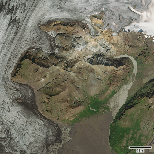
Holmstrom Glacier, Svalbard

Holmstrom Glacier, Svalbard

Bell Island, Franz Josef Land

Bell Island, Franz Josef Land

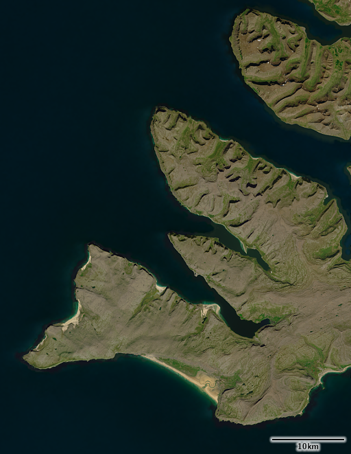
Matochkin Strait, Novaya Zemlya

Matochkin Strait, Novaya Zemlya

May 22, 2025
by chris
2 Comments

Individualism vs. Collectivism and Anarchy vs. Authority in OpenStreetMap

An interesting comment has recently been made by dreamy, a Korean OpenStreetMap contributor, on cultural differences in OpenStreetMap. The topic of how different cultures cooperate in OSM and what challenges this creates has interested me for a long time, so i wanted to point my readers to these comments and share a few thoughts of my own.

We in the cultural West have often very limited insight into Eastern (and also Southern) views on OpenStreetMap and often, when we get a glimpse into those cultures in OSM, we do so through people largely assimilated into a western culture – because they are the ones who often can best communicate in western languages.

Side note (and recommendation) to German speaking readers: For more background on the political/cultural concept of the West i can recommend a recent podcast by Mick Klöcker.

As you probably know, the broad agreement seems to be that Western cultures perceive themselves to be more individualist, while Eastern cultures think of themselves as more collectivist. The linked comment seems to frame this slightly differently in the OSM context as Anarchy vs. Authority (with authority not being primarily the authority of individual humans but of values and order principles) – with the de-facto state of the moment being that of anarchy.

I see substantial elements of anarchy in the way OSM works these days but i would like to suggest that this is less something that is inherent to how OSM works in the context of the cultural West. A few examples:

  • While not of much practical weight these days, the fundamental values of OSM form a fairly clear framework of values that could serve as a guiding principle and value system. The question is more how it came that these values have so little practical significance these days (for some discussion see here).
  • The origin of consensus based decision making in western cultures is not at all tied to anarchy but stems from strongly collectivist communities (like the Quaker movement and other religious communities).

Could it be that the anarchy you can widely observe these days in OSM is more related to the struggles of the more individualist parts of the western culture with the inherently collectivist aspects of OSM?

What i would be very interested to hear is ideas from the cultural East of how to practically counter the anarchy in OSM without ending up with dominance of special interests rather than harmony, universally beneficial order, moderation and collective responsibility. Especially with a huge percentage of community members having grown up in the west, in societies where individual advancement is largely put above the collective good.

Panorama des Doms von Münster

March 30, 2025
by chris
2 Comments

FOSSGIS 2025 – Impressions

English version based on automatic translation with deepl.

The last few days I was at the FOSSGIS conference again for the first time since many years. And I would like to share a few impressions on various topics here.

Schloss Münster

Talk

I presented a talk on satellite image processing at the conference. You can watch the recording at CCC.

The association will probably publish the slides soon.

Satellite image topics that go beyond more or less standardized analytics (we extract some semantic information from the image and then work with it) are always quite exotic at FOSSGIS. I therefore tried to make the whole thing sufficiently easy to understand, which of course means that you can’t go into depth in 20 minutes. The presentation was well attended on site, but most of the feedback was initially – as you can expect at FOSSGIS – about the gaps in the capabilities of FOSS tools that I mentioned.

What is particularly interesting in this context is that it became clear in discussions as well as in various other presentations how much the funding of FOSS development is geared towards short-term immediate needs and how – especially in the area of basic tools such as GDAL – strategic investments are practically non-existent. I have often remarked on this in the context of OpenStreetMap in relation to map design. However, until now I had not realized how widespread this phenomenon is in the FOSS sector in general. But it is quite understandable. When Esri, for example, invests in the development of GDAL, it is not doing so in order to compete with its own products. The aim is more likely to be the same as with other sponsors: to cover immediate needs for its own products and services in the short term.

Against this background, my idea that there might be potential here for an economically viable cooperation between method development (what I do) and professional open source software development that makes these methods available to other users is perhaps somewhat naive. Because such a cooperation would of course only work economically in context of a strategic investment.

Aus dem Vortrag Verarbeitung offener Satellitendaten mit freier Software für die visuelle Anwendung

Cartography

I also attended a number of events at the conference on map design with QGIS and gained interesting insights into this world of interactive map design.

To understand the background: All of my map design work is based on a non-interactive work paradigm. I develop the rules for the design and the associated data processing in the form of rule descriptions in suitable languages (CartoCSS, PostgreSQL, various general scripting languages and structured file formats). Interactive work steps play a role practically exclusively in the design of image symbols. These design rules are then applied to generic geodata (in most cases OpenStreetMap data).

However, users of QGIS and similar tools work in a completely different way. The usual working paradigm there is based on the first-generation digitization approach that has taken place in many areas of work – including cartography: You transfer the pre-digital workflows one-to-one into interactive digital steps. In the field of cartography, this approach has now been further developed to the extent that – at least partially – rule-based work is also possible, i.e. the processing steps carried out interactively can be automatically applied to changed source data. However, rule development is still done completely interactively via a graphical user interface, so you have to click together your map design with the mouse (or alternatively: control the whole thing completely via a programming interface). There still does not seem to be a representation of the design rules in text form designed for human reading and writing.

But of course there is a lot of overlap in problems and solutions between the two approaches. And it was interesting to see where the focus is currently being placed in the QGIS area.

What I found remarkable was how great the desire seems to be among QGIS users to have all solutions within QGIS. For example, a big topic seemed to be displaying charts in maps and what chart types and display forms are available within QGIS. For me, as a firm believer in the Unix philosophy, this seems rather absurd. There are already a lot of good and powerful tools for creating diagrams – also as open source. So why do you need such a function within QGIS? I have the impression that the focus on interactive operation plays a major role here. The user really wants to design the diagrams interactively – just like the rest of the map – and wants to do this with a user interface that is consistent with the rest of QGIS. Of course, this could also be implemented with external tools for creating diagrams, but would largely negate the benefits of modularization in line with the Unix philosophy.

Annual general meeting of the association

I would also like to mention the annual general meeting of the FOSSGIS association. The most important point here was that FOSSGIS wanted to obtain (and received) approval from its members to raise funds from OSM data users on behalf of OpenStreetMap Deutschland – planned in the form of so-called sponsoring memberships in the association without voting rights.

I don’t want to discuss the topic itself in depth here – that might be something for a separate blog post. However, it was interesting to note that I was the only one who did not vote in favor of the motion. This was despite the fact that there were critical questions about the idea at the meeting. I was approached very positively by several people after the meeting – partly in the form of them explaining their own critical perspective on the topic, partly out of active interest in the reasons for my cautious stance. Of course, the fact that I have not received any negative comments on this may simply be ghosting, but I would like to mention it explicitly here anyway, in case this helps others to develop the courage to openly not align with the dominant majority opinion in such cases.

The development and organization of the German-speaking and international OSM communities was, of course, a frequent topic of the conversations I had. And i noticed a relatively strong contrast in those exchanges. On the one hand, there were conversations based on an active interest in diverse perspectives on the OSM community – especially with various active members of FOSSGIS from the non-OSM sector who are interested in further developing the social structures in the association for better integration of the entire diversity of people that the association wants to represent.

On the other hand, I have also had conversations in which a critical perspective on existing structures was either generally rejected out of hand or I was denied the justification and qualification for a critical perspective as an outside observer.

So far, this is not really surprising and basically to be expected. What I find a pity, however, is that there hardly seems to be any nuance between the two. The value of a productive discourse arises precisely from the fact that different points of view and arguments are received sympathetically and then critically examined.

I do not have the impression that the benevolently open and tolerant attitude is being lost across the board in FOSSGIS – I think I have shown that with the descriptions of my discussions at this conference. But I do see the danger that, especially where short-term economic interests come to dominate, closed interest groups emerge that increasingly develop a categorical rejection of views and ideas that are perceived as jeopardize these interests.

Talk recommendations

I’ve only seen a selection of presentations on site – because at FOSSGIS there is always the very practical and reliable option of watching the presentations later on video. From this selection and from various conversations with other visitors, here is a selection of recommendations:

Harald Hartmann: Wie können OpenStreetMap und QGIS einen Wegewart unterstützen? (How can OpenStreetMap and QGIS support a route maintainer?)

The title may not sound so appealing, but it was one of the few OSM presentations at the conference that dealt with practical questions of the social benefits and social integration of OpenStreetMap without focusing on technical or economic aspects.

Roland Olbricht: Kinder, Karten, Open Source (Children, maps, open source)

Just like Harald’s presentation, refreshingly non-technical. And deals with a really important and interesting topic: how to introduce children to concepts of maps and geodata (and geography) and their practical use. What the talk lacks is a consideration of the wealth of experience of child-friendly cartography and geography didactics for children from even pre-digital times. But highly recommended for a first insight into the topic and to raise awareness.

Frederik Ramm: Overpass Turbo goes PostGIS

Not only practically appealing, but also a nice demonstration of how a small FOSS project can be started with practical benefits. Of course, it should also be critically noted that you first have to be able to afford the infrastructure for such a demo.

Falk Zscheile: Text und Data Mining in der OpenStreetMap-Datenbank aus rechtlicher Sicht (Text and data mining in the OpenStreetMap database from a legal perspective)

I haven’t seen this presentation myself yet, but I spoke to Falk about the topic. About a sub-topic from the spectrum of copyright and database law that many people don’t have on their radar.

Panorama des Dom von Münster

March 14, 2025
by chris
1 Comment

The Musaicum United States

I am happy to announce the availability of the next extension of my Musaicum satellite image mosaic series.

The Musaicum images are a series of regional satellite image mosaics based on Sentinel-2 data started in 2023 that are produced to a high quality standard. They offer unsurpassed quality in visual color depiction of Earth at this resolution range (10m) with a high degree of color consistency and an exceptionally low incidence of clouds.

The newly released image covers the United States of America – including Alaska, Hawaii and Puerto Rico.

The Musaicum United States – Contiguous United States

The Musaicum United States – Contiguous United States – click for larger version

The Musaicum United States – Alaska

The Musaicum United States – Alaska

The Musaicum United States – Puerto Rico

The Musaicum United States – Hawaii The Musaicum United States – Hawaii/Puerto Rico

This substantially extends the range of geographic settings the Musaicum process has been adjusted to and evaluated for. This includes, in particular, one of the most difficult areas outside the tropics regarding cloud free image assembly – the Aleutian islands. Accordingly, some small parts of the image use significantly older data (total range from 2016 to 2024). For most of the coverage area, exclusively image data from 2019-2024 is used though. Color calibration and uniformity have been further improved compared to the second generation mosaics (West Asia and North Atlantic Islands)

The Aleutian Islands

The Aleutian Islands

As already discussed with the North Atlantic Islands image, a shading compensated variant and a fractional vegetation data set are now routinely available for the same coverage area.


Mount Rainier, Washington (large: with shading as recorded, with shading compensation)


Musaicum United States vegetation map visualization

Musaicum United States vegetation map visualization

I produced plenty of sample images to allow you to explore the new image on the product page. If you are interested in using the Musaicum United States in your own projects please get in touch.

French Frigate Shoals, Hawaii

French Frigate Shoals, Hawaii

New York

New York

Zion Canyon, Utah

Zion Canyon, Utah

March 5, 2025
by chris
12 Comments

Knowledge retention and generational succession in OpenStreetMap

I wrote a comment today on the OSM-Carto issue tracker that i think should get some broader exposure:

As many know OSM-Carto has the most sophisticated system of road rendering of all operational OSM based maps. Its complexity allows us – more than most other map styles – to highlight and provide feedback on the semantic and structural details recorded in OSM data about roads. But it also creates a substantial barrier to contributors to the map style and makes any changes to road rendering a challenge.

In light of this, improving documentation of our road rendering system would be of immense value. Not only in the short term for OSM-Carto development, but also in the long term for the future of OpenStreetMap as a whole and for map design in general. There are only a hand full of people at the moment who have an in-depth understanding how road rendering in OSM-Carto works – and for most of them this is already historic knowledge (meaning: they are not active in CartoCSS/Mapnik map style development any more).

Unfortunately, those who would have the economic capacity to do so (companies using OSM data, academic institutions, to a lesser extent the OSMF) have shown no interest in investing in the historic memory of OpenStreetMap. And while we, in OSM-Carto, recognize the immense value of this knowledge for the future of OpenStreetMap and OSM based map design we, of course, lack the economic means to ensure this knowledge is preserved for future generations.

So, if anyone following this issue tracker has the means to support an endeavor to preserve the 1.5 decades of historic knowledge and map design experience around the development of OSM-Carto and to document how the most sophisticated operational OSM based map style works or has the means to lobby those who have these means to invest here, then please feel highly encouraged to become active here.

OpenStreetMap has meanwhile grown older than most digital social endeavors, while staying at least moderately healthy so far. But it has not yet survived a true generational succession. Many people from the early years of OpenStreetMap still cover key functions within the project.

For any community of people to be sustainable in the long term it has to accomplish two important things

  • be able to manage a true generational turnover
  • develop a balance between
    • the need to give new generations of community members the room and the ressources to develop beyond the horizon of the previous generations (and this way becoming capable of true evolutionary development)
    • the need to develop and maintain the collective wisdom and experience across generations (allowing for long term innovative advancement and a conscious selection of the evolutionary path)

The first point is a social matter, OpenStreetMap definitely struggles with the generational turnover. I discussed this in context of the OSMF in the past – where there are, in particular, a few influential people clinging to their influence. But accomplishing this also depends a lot on the balance described in the second point – which is not only a social question but also an intellectual and an economic challenge.

In the context of celebrating the birthday of OpenStreetMap, commenters have, in the past, often used metaphors of youth and coming of age. I think this might be the wrong perspective. In the fast moving digital world 20 years of age might be more like 40 or 60 years in terms of a human life.

Map design is a particularly good example for the challenges OpenStreetMap faces at this stage of its development in my opinion. Not only because it depends so much both on people with a broad perspective and much experience and – at the same time – on new approaches being tried and developed by unprejudiced minds. But also because, even during the short history of OpenStreetMap, we have had already various examples where substantial wisdom and knowledge was lost because those who carried that knowledge dropped out of the project without being given the space, the appreciation and the support that would have been needed to allow them to substantially pass it on (Osmarender and TopOSM just to mention two prominent cases). At the same time, young people with talent and interest in map design do not get the supportive environment they would need to develop their skills – as i have also pointed out in the past.

Some might say: What does it matter? Evolutionary development inherently involves failures and losses. Quite true. But OpenStreetMap does not exist in a vacuum. The world around us evolves as well. And i have doubts that OpenStreetMap can afford to retreat to its island and simply start over with every new generation of map designers.

The Musaicum North Atlantic Islands

February 6, 2025
by chris
1 Comment

The Musaicum North Atlantic Islands

After the larger regional Musaicum satellite image mosaics of Europe and West Asia this further extension of coverage of my Musaicum satellite image mosaic series probably does not look very significant. But it represents a milestone in several aspects i am going to explain here.

The Musaicum North Atlantic Islands

The Musaicum North Atlantic Islands – click for larger version

From past work on local mosaics of the area – Iceland, Jan Mayen and the Faroe Islands i knew that these are the hardest part of Europe as far as producing a quality image is concerned. The short summer season combined with high cloud incidence with very diverse cloud types in summer make this a challenge. That was partly the reason why i did not include these areas in the EU-Plus coverage in 2023 – because that would have meant spending an extraordinary amount of time to make it work in the desired quality back then.

Now, with an additional year worth of data available and the improvements meanwhile made to the assembly process i decided to give it a try. And the results are remarkably good.

Akureyri and North Iceland

Akureyri and North Iceland

Reykjavik

Reykjavik

Stress testing the process

I discussed the difference between classical mosaic production techniques and pixel statistics methods before. With pixel statistics methods you can rely on the simple rule that if you use more data the quality of your results will improve (all other things being equal of course) – if that is not the case the method used is flawed. The rate of convergence, i.e. how much the results improve from using more data, varies, but the very principle that it does is universal.

With classical mosaicing techniques this is not generally the same. Adding more source data will only improve the results when that data is better than the data you already have. Otherwise it is equally possible that the quality of the results will decrease. Avoiding that is one of the primary goals in developing mosaicing techniques.

The North Atlantic Islands are a good test case to evaluate that because you need a large number of source images to ensure that every part of the area is covered with decent quality data. Even if you have a largely cloud free summer image in some area (which is rare in many parts) that might feature fresh snow in the mountains for example (which is common in Iceland even in summer).

The results are quite decent in light of this – the cloud incidence in the mosaic is not measurably higher than in continental Europe and West Asia and the uniformity is good as well. And there is substantially less seasonal snow than in my older manually produced Landsat/Sentinel-2 mosaic.

Without shading and shadows

The other major improvement is about the additional layers generated in the Musaicum production process. I had introduced the shading compensated version of the mosaic already with the Europe image. This offers – as discussed there – substantially better results than the L2A data available from ESA. The process to produce this was adapted from methods previously used in local mosaics – discussed in 2019. But the handling of shadows left a lot to be desired so i spent some time in 2024 on improving these methods. This was already tested at scale in the production of the West Asia mosaic but i did not have the time back then to evaluate the results in more detail.

Again the North Atlantic Islands were a good test case for this because at high latitudes shadows in satellite images are more of a problem than at lower latitudes. The results can be seen here.

Mountains in southern Iceland with shading as recordedMountains in southern Iceland with shading compensation

Mountains in southern Iceland (large: with shading as recorded, with shading compensation)

Eastern Iceland with shading as recordedEastern Iceland with shading compensation

There is some degree of under-compensation of shading (which – at least for visual applications – is much preferable to over-compensation) and shadows are not always reliably detected (in particular shadows on wet snow are notoriously difficult to discern from water surfaces). But apart from that i am quite satisfied with the results here as well.

The other additional layer – the fractional vegetation data set – received an upgrade as well. This improves continuity across the tiles the data is processed in.

Visualization of the Musaicum vegetation data set

Visualization of the Musaicum vegetation data set

Both the shading compensated version of the image and the vegetation data set are not considered experimental any more and are now available for licensing like the regular mosaic. I am also going to make both of these available retroactively for the West Asia mosaic as time permits.

If you are interested in the North Atlantic Islands image please have a look at the product page for more details and samples. If you are interested in additional Musaicum coverage in areas so far not available please get in touch.

Bjargtangar, Iceland

Bjargtangar, Iceland

Tórshavn, Faroe Islands

Tórshavn, Faroe Islands

Pipelines rendering

November 28, 2024
by chris
3 Comments

Drawing the line #4 – Plumbing

This post adds another chapter to my previous series of posts on line signatures in maps.

Back in the first part of the series i explained and illustrated how the sophisticated techniques in using line signatures in pre-digital maps have practically largely been replaced by rather primitive line drawing in digital map production. And i showed some methods how you can, in digital rule based map design, work around these limitations.

Here i want to supplement this collection of techniques with some ideas on line dashing.

Dashing

Interrupted lines with dashing and dotting are one of the techniques that survived the transit to digital map production. Line dashing is available in most digital map rendering frameworks, often including the ability to define complex dashing patterns through dasharrays. This allows, in principle, to digitally reproduce many design concepts developed in pre-digital maps that make use of line dashing. But, if you look closely, the level of quality of drawing with dashed lines in digital maps is often rather low.

Here are a few examples of pre-digital use of dashing in maps:

1947 reprint of 1942 Japanese gaihōzu map of Seoul, Korea

1947 reprint of 1942 Japanese gaihōzu map of Seoul, Korea

Polish 1:25k map sheet M-34-101-A-c (Rysy) from 1960

Polish 1:25k map sheet M-34-101-A-c (Rysy) from 1960

Landeskarte der Schweiz 1:25000 1993 Blat 1268 Lötchental

Landeskarte der Schweiz 1:25000 1993 Blat 1268 Lötchental

Italy 1:50k US wartime map based on Italian 1:25k from 1934

Italy 1:50k US wartime map based on Italian 1:25k from 1934

What these examples demonstrate is how dashing adds another dimension of differentiation to simple line signatures (apart from line width and color) and also how more complex shapes of dashes can be used to highlight specific line element classes – like it is frequently used in case of boundaries.

What you can also see when you look closely is that in practical drawing the dashing is not just a simple mechanical repetition of a certain dash + gap sequence along the line with pre-defined dimensions. The dashing is adjusted to the context, usually in a way that ensures the individual line segments start and end on a dash – or, in case of junctions, that there is no gap directly at the junctions.

Pipelines in OSM-Carto

Digital rule based map styles typically do not do this – they mechanically and blindly repeat the defined dashing pattern along the line. For simple dashings this is often not that much of a problem, but for more complex patterns generated using dashing it frequently is. A good case example for this in OSM-Carto are pipelines.

Pipelines at z18 in OSM-Carto

Pipelines at z18 in OSM-Carto

Pipelines at z19 in OSM-Carto

Pipelines at z19 in OSM-Carto

Pipelines are rendered in OSM-Carto with a somewhat complex dashing pattern that is meant to resemble tube segments with flanges in a simplified form. In principle, this is an intuitive approach to showing pipelines. It even allows visualizing the substance through the choice of fill color at the higher zoom levels. The very mechanical drawing of the pattern, however, causes problems:

  • The drawing starts at an arbitrary position in the pattern (in this case with a flange) at the start of each linestring. This looks odd at junctions and when a pipeline is split in mapping into several segments, for example to apply different secondary tags.
  • Flanges can occur arbitrarily at any position along the line, in particular also at junctions and at sharp corners.
  • In addition, the individual line strings are drawn strictly one after the other with both casing/flanges and fill – leading to junctions not being displayed as connections of the pipelines.

Pipelines improved

Here is how the improved rendering in the AC-Style now displays the same configuration.

New pipeline rendering in the AC-Style at z18

New pipeline rendering in the AC-Style at z18

New pipeline rendering in the AC-Style at z19

New pipeline rendering in the AC-Style at z19

This is primarily achieved by two things:

The dashing pattern is adjusted in length and phase to the line length in a way that they start on a pipe segment in the middle between flanges and end in the same fashion.

Dashing pattern adjustment to the segment length

Dashing pattern adjustment to the segment length

And the pipelines are split at intersections among themselves and with other line features, specifically roads, and at the same time separately mapped pipelines are merged where two of them meet end to end when they share relevant attributes. Furthermore, the dashing is also split at sharp corners.

Dashing adjustments when pipelines intersect with roads

Dashing adjustments when pipelines intersect with roads

In addition, the pipeline rendering is integrated into the road layer so pipelines are correctly layered both relative to each other and relative to roads. And they are shown with a correct drawing order for casing and fill.

Pipeline layering relative to other pipelines and roads

Pipeline layering relative to other pipelines and roads

I also re-designed the use of color to visualize the substance transported in the pipeline.

Different line colors used for different substances at z19

Different line colors used for different substances at z19

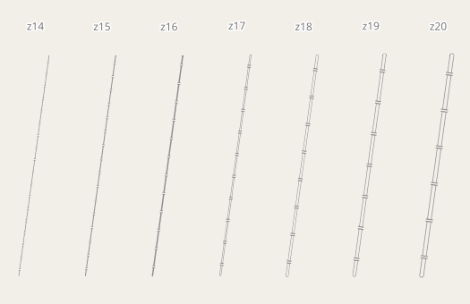
The zoom level progression remains similar to that in OSM-Carto with some smaller adjustments.

Zoom level progression of the pipeline rendering

Zoom level progression of the pipeline rendering

Real world examples

Fuel pipelines at z18 at the Frankfurt Airport

Fuel pipelines at z18 at the Frankfurt Airport

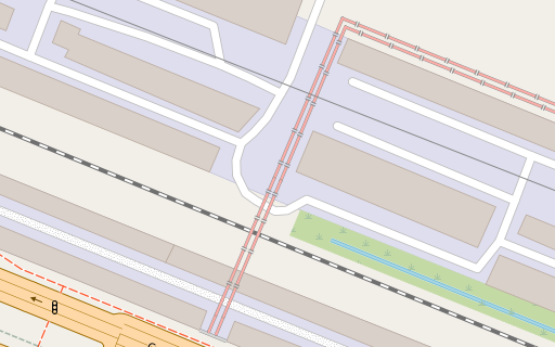
Gas and unspecified content pipelines at z18 in St. Petersburg, Russia

Gas and unspecified content pipelines at z18 in St. Petersburg, Russia

Hot water pipelines at z18 in St. Petersburg, Russia

Hot water pipelines at z18 in St. Petersburg, Russia

Conclusions

What i demonstrated here is that use of line dashing with current map rendering frameworks is not strictly limited to the primitive mechanical application of a static dashing pattern, as it is common in automatically rendered maps these days. Achieving high quality dashing with the techniques shown here requires both dynamically adjusting the dashing pattern to the individual geometry and splitting and merging geometries based on their shape, geometric context and topology. The dynamic dashing pattern adjustment also requires a custom modification to Carto that allows defining dasharrays through fields.

The benefit of doing this is a much clearer and much better readable map image with fewer artefacts and a more organic depiction of dashed features.

The implementation of what i described in this blog post can be found in the AC-Style.

More map symbols

November 1, 2024
by chris
11 Comments

More map symbols

In addition to the point barrier symbols i also re-designed and extended quite a few of the existing symbols in the style for human built structures of all kinds.

Starting point was that i wanted to port back some of the changes in OSM-Carto that happened after i created the AC-Style. But i did not want to use these designs as is. Instead i wanted to re-evaluate the design decisions made in the process.

Waste and recycling

First part is the display of waste/recycling related features. OSM-Carto uses three different symbols here – for amenity=recycling, amenity=waste_disposal and amenity=waste_basket:

Waste and recycling related symbols in OSM-Carto - link goes to double resolution rendering

Waste and recycling related symbols in OSM-Carto – link goes to double resolution rendering

This approach has a number of issues:

  • amenity=recycling is used for a large number of different recycling related facilities of very different size and scope. Showing them all with the same symbol is not a very good approach.
  • Differentiating amenity=waste_disposal and amenity=waste_basket through generic waste bucket symbols of different size is not very intuitive. Map users will often not see both together and when seeing just one of them you don’t have the necessary context to interpret the size of the symbol as it is meant.
  • The recycling symbol is poorly readable at normal resolution
  • The lid of the waste_disposal symbol is oddly far from the bucket
  • The choice of different colors for recycling and waste_disposal/waste_basket is not intuitively understandable
  • The display of access restricted variants is not very consistent

Here is the new design schema i have developed now:

New design schema for waste and recycling related features in the AC-Style

New design schema for waste and recycling related features in the AC-Style

Concrete changes are in particular:

  • uniform color for all symbols
  • new design for amenity=waste_disposal and amenity=recycling + recycling_type=container. This depicts a classic movable waste container with wheels and hinged/sliding cover. Of course design of recycling containers varies but the basic wheeled waste container is probably known very widely and facilitates a clear intuitive distinction form amenity=waste_basket.
  • re-designed recycling symbol for better readability at small sizes
  • distinct symbols for generic amenity=recycling and amenity=recycling + recycling_type=centre
  • more harmonic lid gap size on amenity=waste_disposal and amenity=waste_basket

Towers and masts

Towers and masts in OSM-Carto already use a systematic symbol design to visualize the different variants of construction and purpose. But this set of designs has substantial gaps. More advanced in that regard is the Röntgen icon set by Sergey Vartanov – which partly served as inspiration for the work presented here.

For better understanding: The difference between man_made=mast and man_made=tower is not completely agreed on in OpenStreetMap. As a rule of thumb: A structure that qualifies as a building (i.e. that has a human walk-able inside) is generally a tower. So is a structure that has integrated steps to walk up. Something that can only be climbed up tends to be a mast.

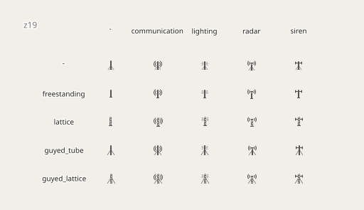
Here is the set of designs i use for man_made=mast:

Rendering variants of man_made=mast based on tower:type and tower:construction

Rendering variants of man_made=mast based on tower:type and tower:construction

In terms of construction that includes the four main variants (with guyed_tube being the least common). In terms of function i added designs for radar and siren.

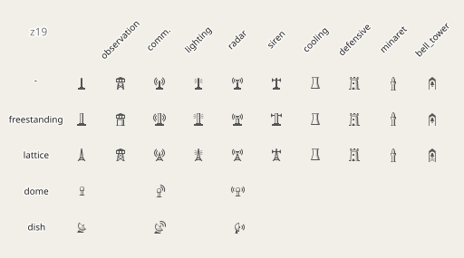
For man_made=tower the set of symbols is more extensive:

Rendering variants of man_made=tower based on tower:type and tower:construction

Rendering variants of man_made=tower based on tower:type and tower:construction

For the main functional types (observation, communication, lighting, radar and siren) there are now distinct variants for all the main construction types – as far as they are sensible combinations. And i added rendering of tower:type=minaret.

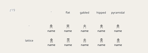
As additional detail i introduced depiction of roof:shape to bell towers. This might be considered too detailed semantically – but it is a good demonstration how subtle design differences can be used to transport additional information.

roof:shape based variants of bell tower depiction - with lattice construction on bottom and other constructions (including none specified) on top

roof:shape based variants of bell tower depiction – with lattice construction on bottom and other constructions (including none specified) on top

Symbol abstraction levels

With the tower symbols you can also see that i moved the design of some of the symbols away from the solid color paradigm in OSM-Carto to a shaded depiction. Original motivation was that the OSM-Carto symbols are too variable in visual weight – leading to the heavier symbol appearing as more important in the map than the lighter ones (without there being a good reason for that).

Substantially different visual weights of symbols in OSM-Carto

Substantially different visual weights of symbols in OSM-Carto

The other reason is that the symbol design paradigm of OSM-Carto currently puts a strong emphasis on geometric clarity and simplicity of shape – up to the point that the level of abstraction severely affects intuitive understanding. Adding shading to the symbol design, limiting the level of abstraction and allowing sub-pixel details to be used where helpful can aid substantially in resolving visual ambiguities and communicating additional information in very limited space. This of course increases the demands on symbol design work.

Shading is implemented without transparency using half-toning techniques.

Half-toning patterns to implement shading effects in single color symbols

Half-toning patterns to implement shading effects in single color symbols

Other engineered structures

Here are a number of further new symbol design either newly added or as replacement for existing symbols:

Various re-designed and added symbols for engineered structures

Various re-designed and added symbols for engineered structures

The non-solid, shaded symbol designs also give room to illustrate substances stored/processed by a feature through the use of color. This has to be done carefully because color is already used for differentiating different broader categories of symbol so adding more use of color in point symbols can severely reduce map readability.

Storage infrastructure symbols with different substances indicated by color

Storage infrastructure symbols with different substances/content indicated by color (with industrial background color)

Cranes are shown in different designs depending on crane:type:

Symbol variants for different crane types

And lighthouses are, by default, rendered without the light visualization – that is only shown with the appropriate seamark tags. And for non-continuous lights a subtle variation is used.

Variation of lighthouse rendering depending on seamark tagging

Variation of lighthouse rendering depending on seamark tagging

Petroleum wells

I also added display of petroleum wells (man_made=petroleum_well) in a design derived from that of water wells. Wells tagged with pump=yes are shown with a traditional oil pump symbol. Disused wells get a symbol variation and substance (oil or gas) is differentiated by use of color.

Petroleum wells - how they are shown depending on different secondary attributes

Petroleum wells – how they are shown depending on different secondary attributes

Planters

In terms of less technical features i added rendering of man_made=planter for both nodes and polygons:

Rendering of man_made=planter - mapped with node or polygon

Rendering of man_made=planter – mapped with node or polygon

The design for polygon is derived from that of retaining walls and is simplified for small geometries. In addition, i show a hint of a shadow towards the bottom right to show the elevated nature of the feature.

Benches

I am going to close this list of new symbol designs with another one i had already developed some time ago – a new design for benches.

Benches are rendered in OSM-Carto at z19 with a uniform symbol. I extended this both in terms of zoom levels and in terms of differentiation based on additional attributes – and with support for amenity=lounger in addition.

Rendering of benches at z20 - link goes to double resolution version

Rendering of benches at z20 – link goes to double resolution version – z19, z18

At z18 the benches are all shown with a uniform symbol just like on OSM-Carto – but significantly smaller. This is recognizable – yet small enough to not overcrowd the map at z18 in most cases. At z19, benches with backrest get differentiated – as well as loungers. They are still shown with a smaller symbol than in OSM-Carto. At z20 and above i then show the full size symbol with

  • three different symbols based on backrest=yes/no/unknown – the unknown design being inspired by Röntgen again.
  • heavier and less heavy symbols based on the material – stone, concrete and metal get the heavy design, wood and plastic the lighter one. This difference is very subtle to not limit the recognizability of the symbols to be the same type of feature in principle.

Real world examples

That were a lot of different symbols so i am not going to be able to demonstrate all of them in a real world context. So just a few select examples:

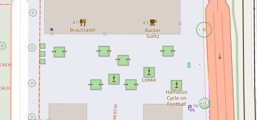
Planters and benches in Heidelberg, Germany at z18

Planters and benches in Heidelberg, Germany at z18

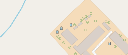
Water tanks on a farm in northern Italy at z18

Water tanks on a farm in northern Italy at z18

Cranes at the shore of Lago di Garda, northern Italy at z18

Cranes at the shore of Lago di Garda, northern Italy at z18

Harbor crane in Strasbourg, France at z17

Harbor crane in Strasbourg, France at z17

Water mill near Freiburg, Germany at z18

Water mill near Freiburg, Germany at z18

Benches in Lyon, France at z20

Benches in Lyon, France at z20

Silos in northern Italy at z19

Silos in northern Italy at z19

Petroleum well near Strasbourg at z18

Petroleum well near Strasbourg at z18

Discussion

I have presented here a large number of symbol design changes and additions. Many of them are not really revolutionary but rather simple. None the less i want – in summary – point out a number of patterns in those changes and lessons to be learned here.

Designing maps for a global audience is hard because many elements that are common in some part of the world are rare or even completely unknown in others. The most obvious example from what i presented above is the minarets. But there are other things where this applies as well – siren towers/masts or petroleum wells for example. Even something like a lighthouse will be familiar to people in coastal settings while fairly unknown for those living far away from the coast. Developing a good design for those depends on real world familiarity with the various settings where these things occur. That is why a map design project with global scope heavily depends on designers with diverse geographic and cultural backgrounds and familiarity with the global geography. While OSM-Carto aims in that direction i think i have demonstrated here a bit – in the past as well as in this post – how much the choices in OSM-Carto still reflect an urban/near urban European/North American perspective. This is of course not fully the fault of OSM-Carto – mapping and tagging in OSM itself still has a similar bias.

OSM-Carto has struggled not only technically with handling a huge number of different point symbol classes. The approach to add – one by one – new primary feature classes, each with an independently developed design, had reached its limit quite some time ago. I had already shown a number of techniques that can be used to overcome this problem in the past (see links above). Methods demonstrated here are in particular:

  • Aiming for depth instead of breath in terms of feature classes shown. Having recognizable base designs for broader categories of features and using subtle variations of symbols to differentiate further helps a lot in keeping symbology intuitively readable.
  • Using smaller and simplified symbols at the lower zoom levels can help to avoid having too much noise in the map while maintaining the in depth differentiation at the higher zoom levels.
  • Carefully using color for secondary differentiation (here: substance/content in storage structures) can help transporting additional information.
  • Shading and sub-pixel design in symbols can improve readability and allows additional differentiation of symbols with limited space.

All the changes presented here can be found in the AC-Style now.