It has been some time since i wrote the last review of a satellite image mosaic product. In fact the last one i did was for the last Google image mosaic based on Landsat 7 data three years ago. Now they have rolled out a new version of their base mosaic i am going to review here.
But first a general look at the three years in between. Why did i not do any reviews since then? Apparently because there was not much to review. Of course there were a few cases where map services put in some local image updates and improvements in their image layers. For example Bing recently filled some of the most obvious gaps in image coverage. But technologically these three years have been pretty uninteresting, nothing really revolutionary was released in the field of global mosaics, at least not publicly – so nothing to review really.
In terms of data – we remember Landsat 8 began operations a bit more than three years ago so during all this time a veritable heap of free high quality data has been piling up. And Google apparently thought it was time to put this to use in their base image product.
Has something changed?
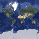
If you look at the new image compared to the old at a coarse scale (new left):


you can hardly see a difference. Overall apparently not much has changed in their processing system. This especially means they apparently use the same color homogenization and color transfer techniques they have used before which leads to a globally fairly consistent appearance (for which – in light of the many other mosaics with colors grossly off – i commended them in my last review). But this also means locally color nuances get lost and the fairly good color reproduction of Landsat 8 is – i hate to say it – mostly wasted.

Comparison new-old from northern Ellesmere Island

Comparison new-old from Siberia
But before we have a closer look locally some basic facts overall. The image mosaic, just like the old one, is nearly global – as far as the Landsat coverage goes but excluding the Antarctic. In areas where they previously already used other images at the low zooms they continue to do so (Svalbard, South Georgia and a few other places). For the Antarctic they continue using LIMA, in the north beyond the Landsat coverage they now have a fairly poor low resolution image with the source not identifiable.

At the Landsat limit in northern Greenland

My own Greenland Mosaic for comparison
As you can also see in the sample above they still use the same inaccurate coastline mask cutting off their image data in the middle.
What is improved?
Well – since their main source of data now is Landsat 8 data from the last three years one thing that improved for sure is the imagery is more up-to-date. Previously with the Landsat 7 data basis the average image was likely from around 2007 and now it is likely from 2014. Note however that a three years data basis is not much data to deal with (which is why we have not seen any other global Landsat 8 mosaic so far). It seems Google did also continue to use Landsat 7 data to some extent – this is generally well visible in form of the characteristic striping which will not occur with Landsat 8 images.

Landsat 7 striping in the new Google mosaic
Their clouds handling seems to have in parts somewhat improved – possibly because they used the Landsat 8 data in addition to the images used before there

while in other areas it is significantly worse

While the areas shown previously are simply very hard concerning clouds there are also cases where they would have been completely avoidable:

Probably partly due to the relatively small overall image volume areas with strong seasonality like high latitudes and high mountain areas are often quite bad as well.

Google in the Alps

My Alps mosaic for comparison
Conclusions
Overall i am not really sure why Google produced this update. There was no real pressure from the competition making their imagery appear outdated – after all most map services still use the much older Landsat 7 images from before the SLC failure (1999-2003) as base imagery. I suppose they mostly see this as a demonstration of their satellite image processing platform which they also market independently.
In terms of technological development i don’t see much here though. If you know the difference between Landsat 7 and 8 regarding the source data quality, especially noise levels and dynamic range – the new mosaic seems rather disappointing. So the main thing this demonstrates is that their processing framework is sufficiently robust to produce a new mosaic from a changed data basis with comparable results.
And of course they show that they can still with their pinkie do what others have not been able to do for many years – namely produce a globally consistent and visually at least at a coarse look cloud free satellite mosaic in this resolution range.